Buildin' an EHR- Healthcare Edition #1
Designing the patient side
Notes & Sketches from an EHR redesign (concept) that would ideally help in:
- Better collaborating with patients on the patient journey
- Better management
No need to point it out by shocking that "Kay, that's way too many things..." It's a stupid weekend side-project for god's sake!
Moodboard
Then I went through the whole stylescape process of:
- Defining attributes:
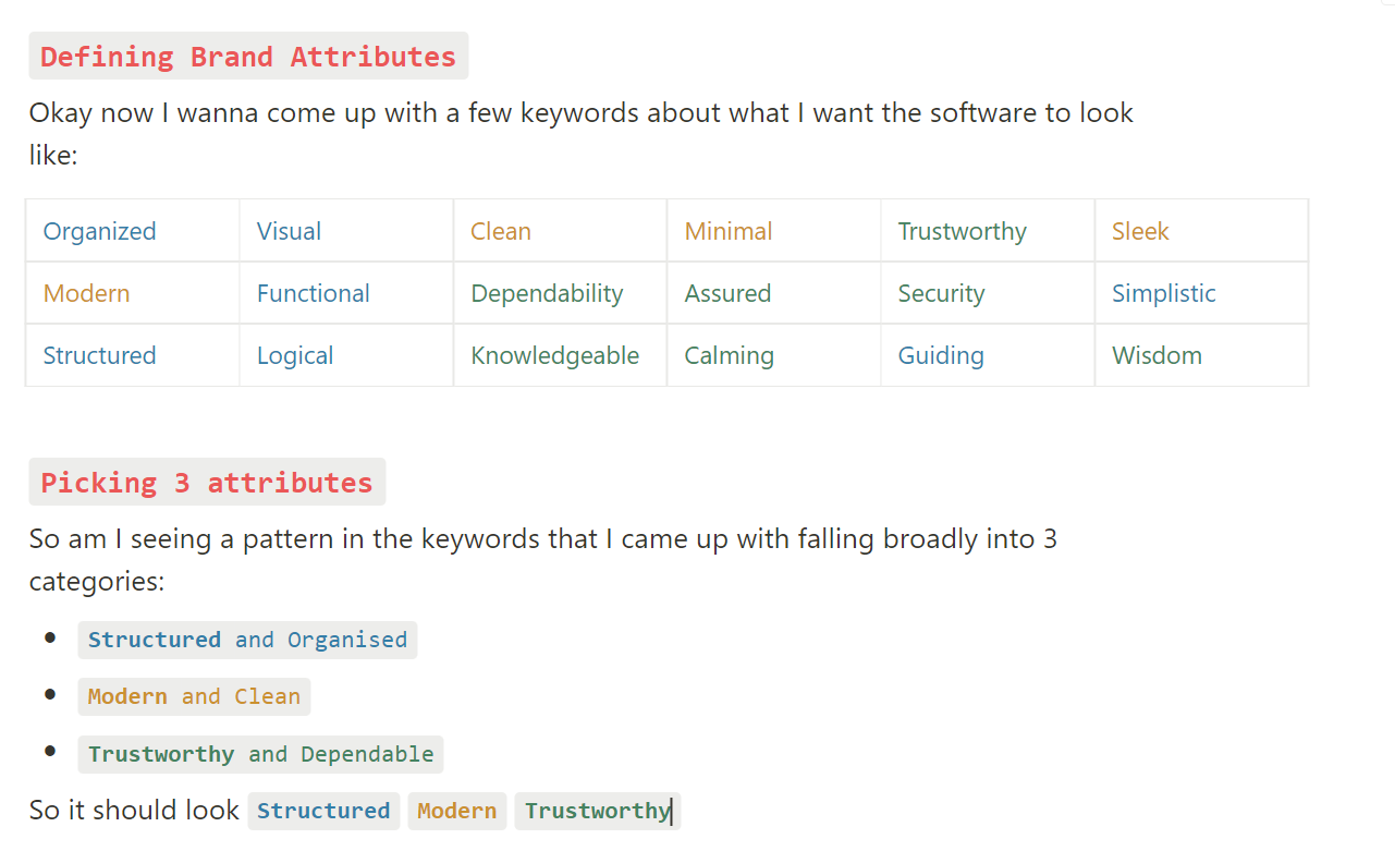
2. Creating Image Buckets:

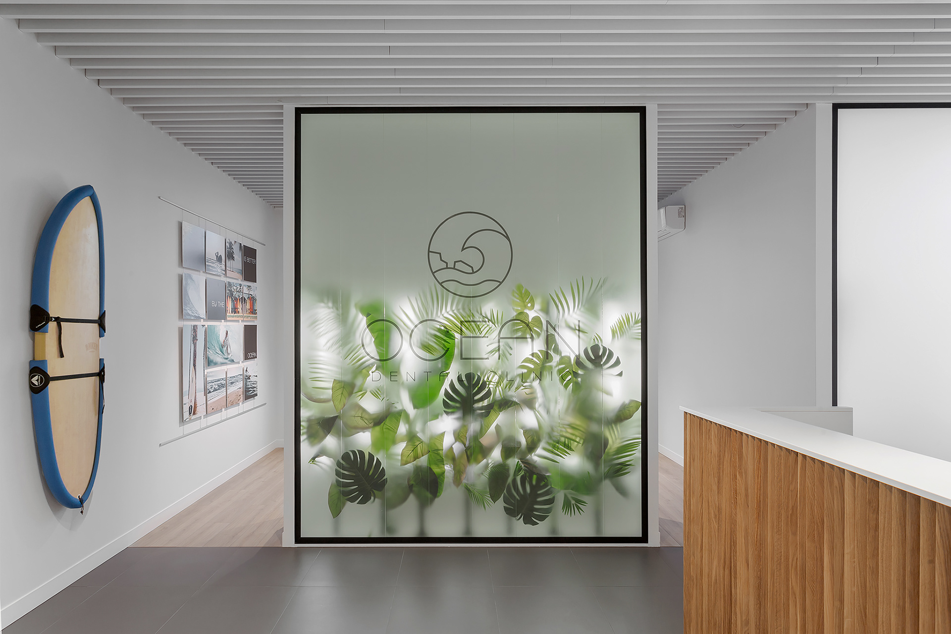
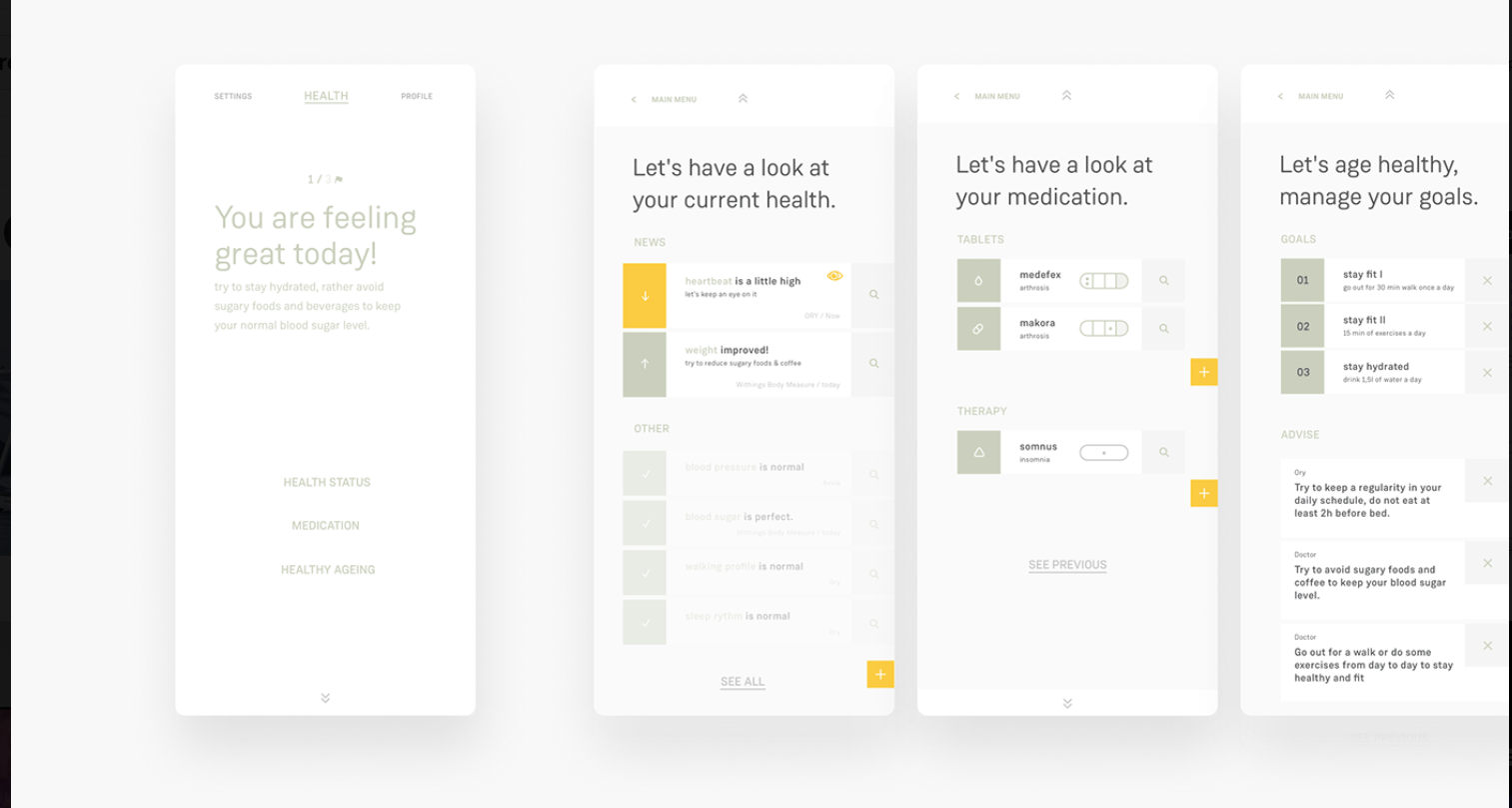
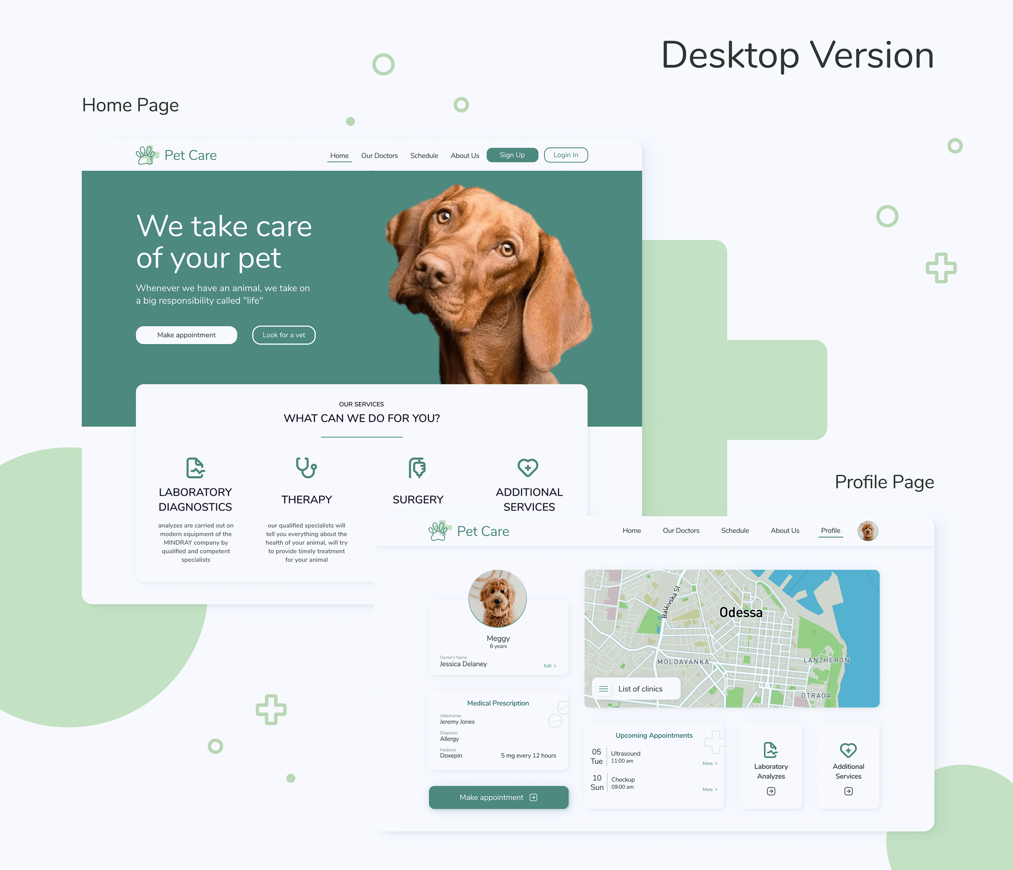
A basic snapshot from the image bucket for the general look and feel of the whole thing I was aiming for...
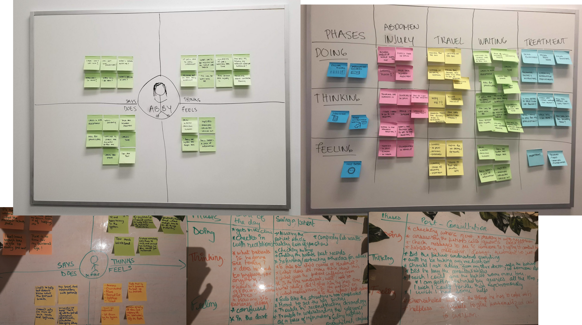
3. Empathy Mapping:
And then taking inspiration from this:
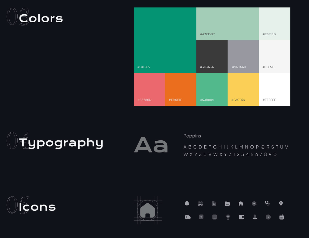
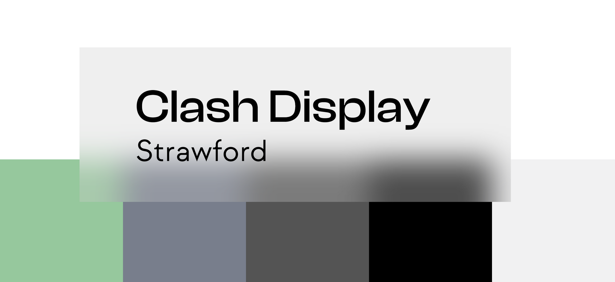
Here are the colours and fonts I settled for.
Finally building some shit...
Not that we're over with the basic look tone and feel for the thing is set let's start building the goddam thing.
So here's the process that I'll be using to build it:
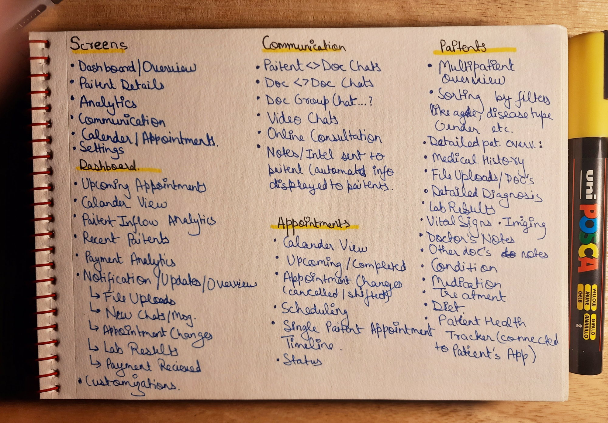
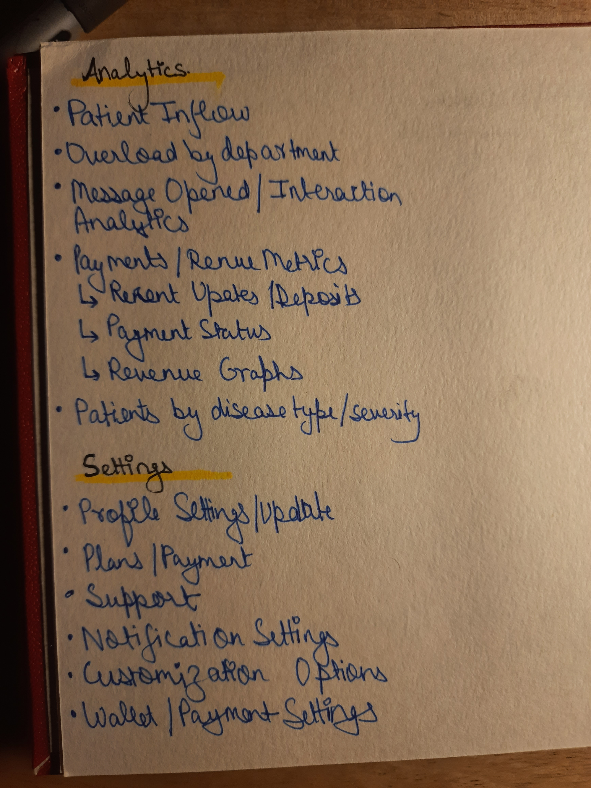
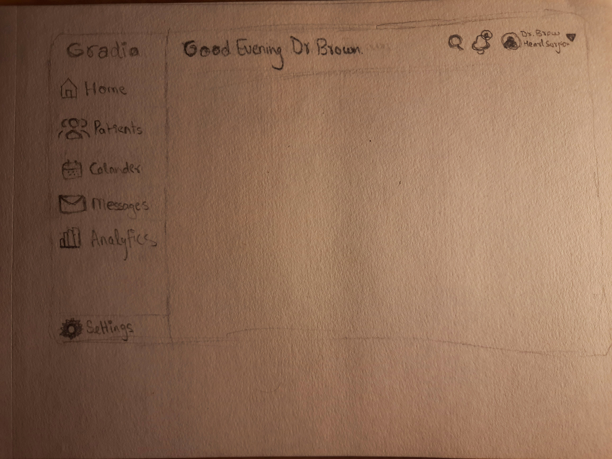
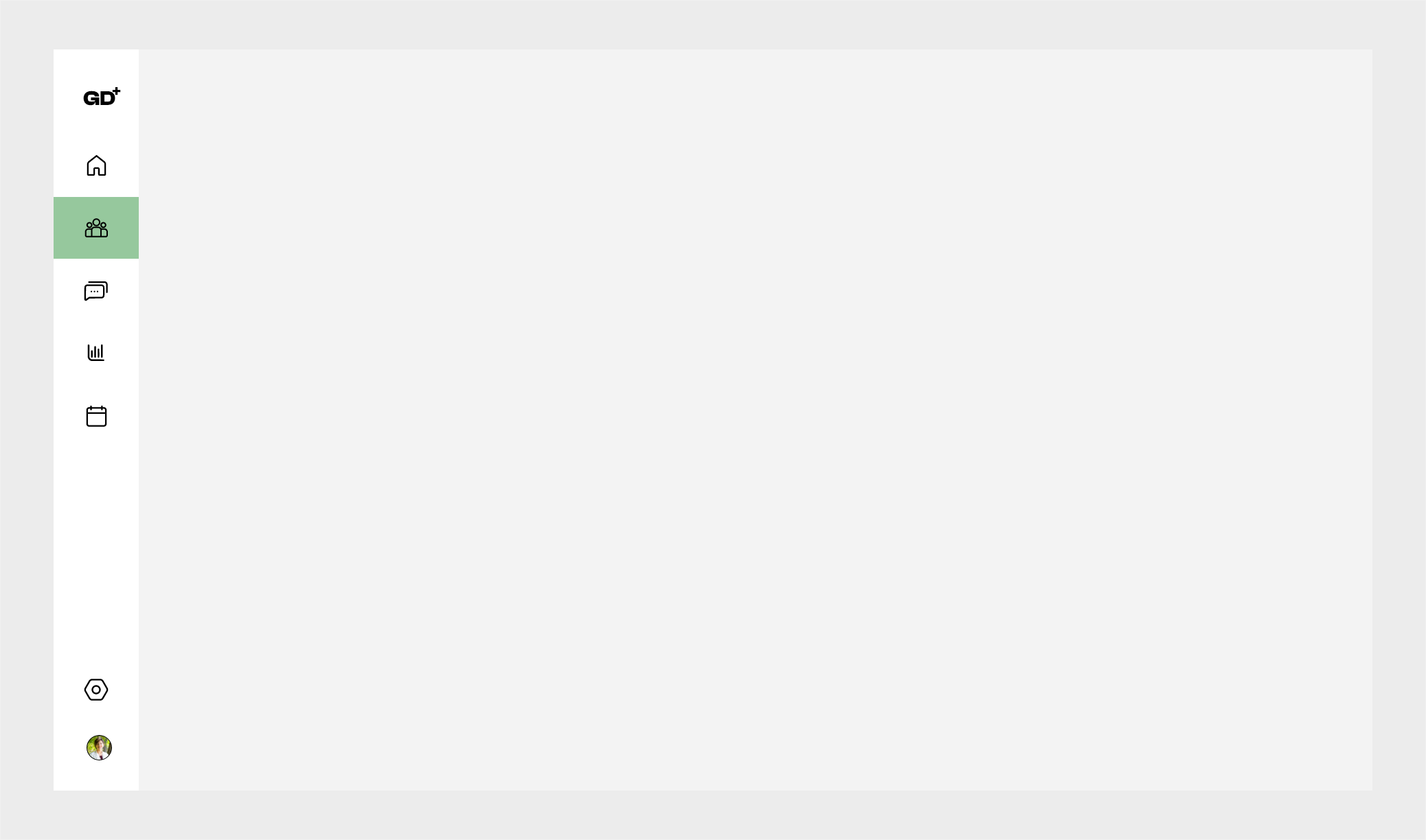
The dashboard sidebar thingy...
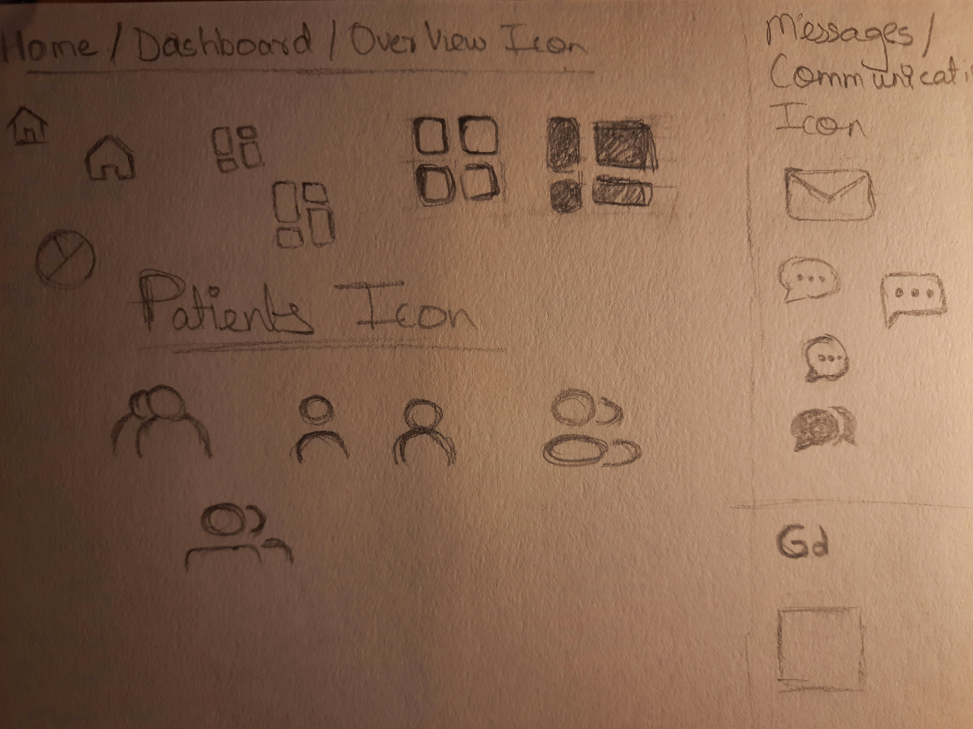
I think I’ll go with the boxy ones, they fit more with the design language...
Final Prototype:
Now with that done, I'm gonna start with the patient screen since that seems to be the most complex and challenging one...
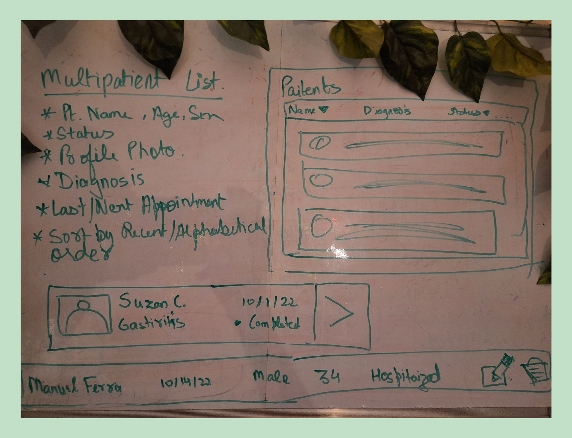
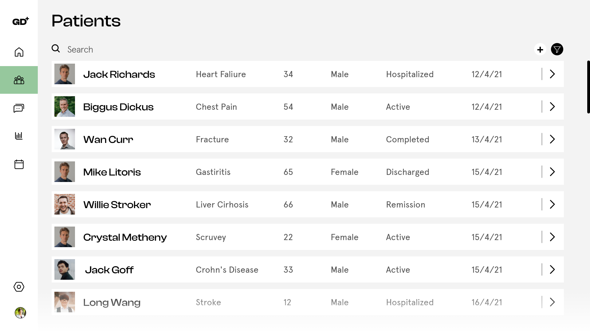
The Multi-patient Screen
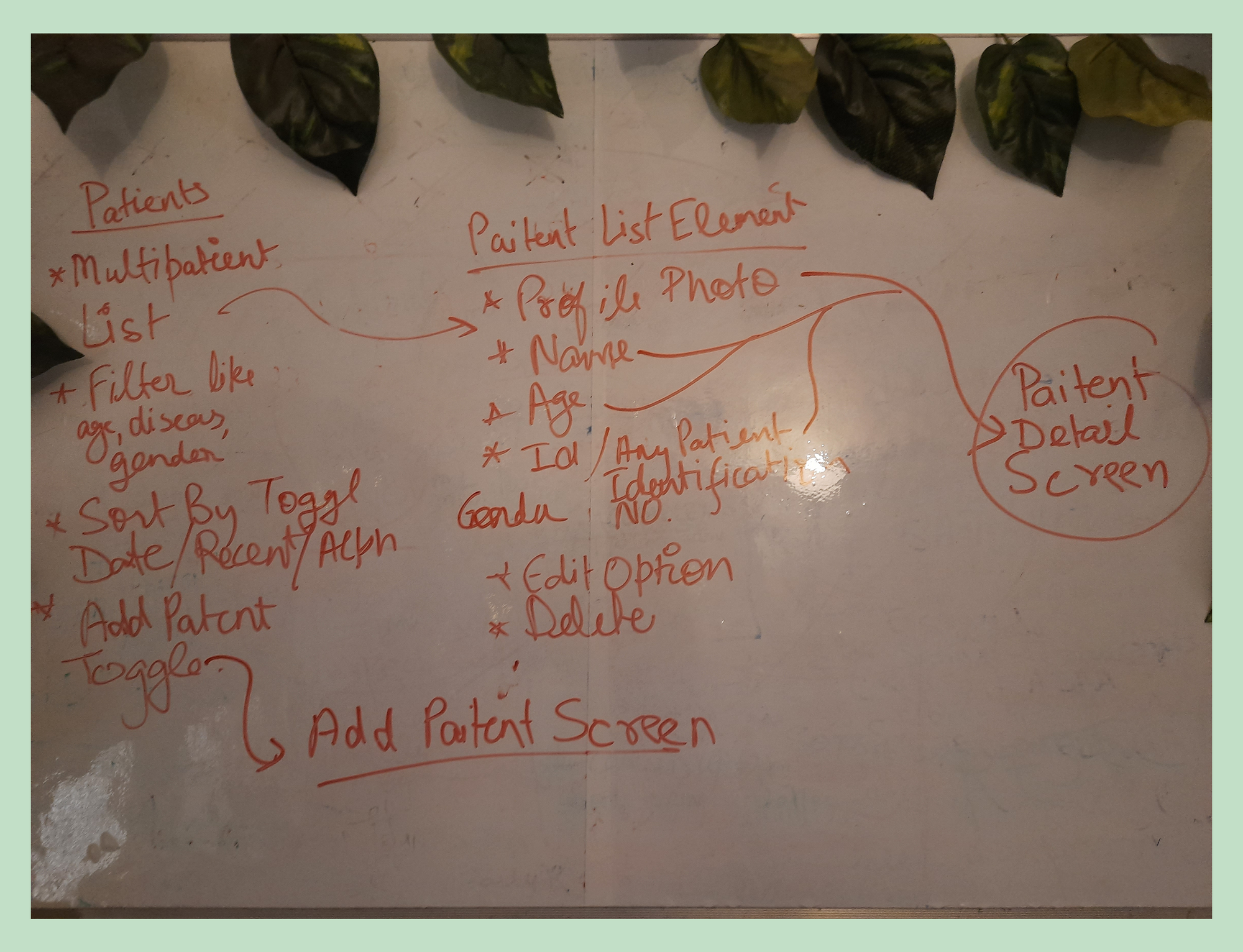
So it seems that the patient screen can be broken into two levels:
- The Multi-Patient List Screen
- The Detailed Patient Screen
Okay, let's make the multi-patient list first.
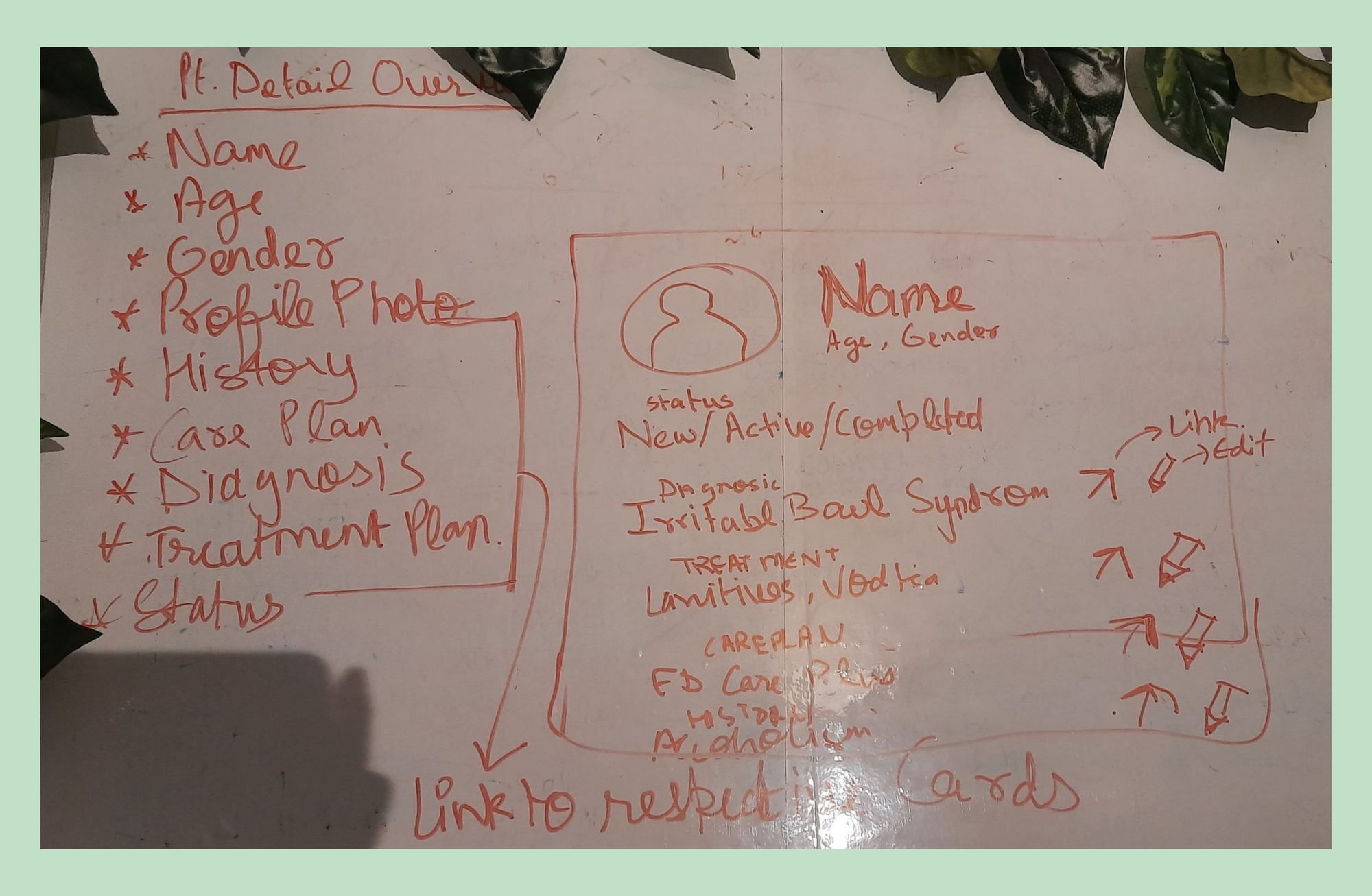
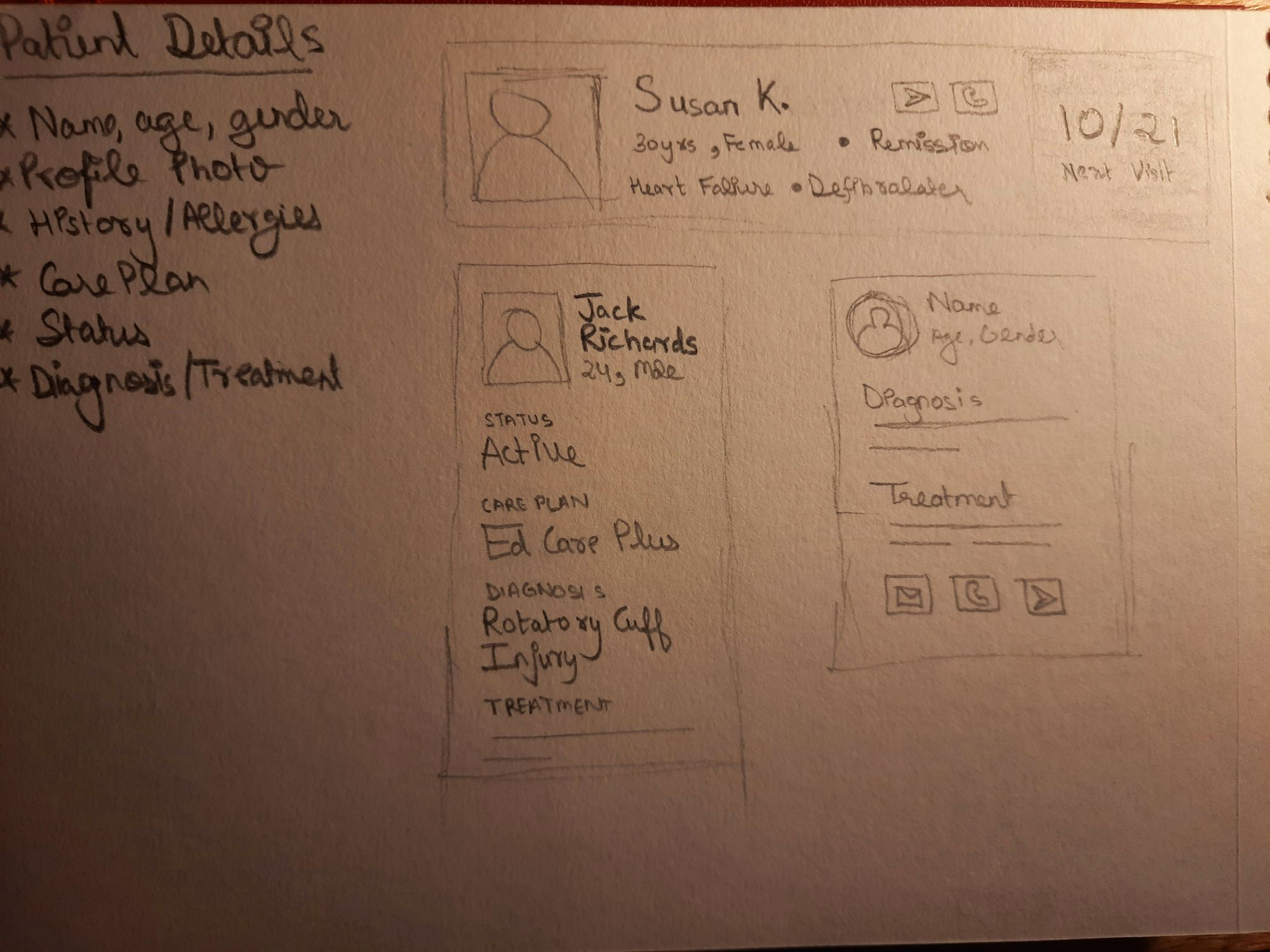
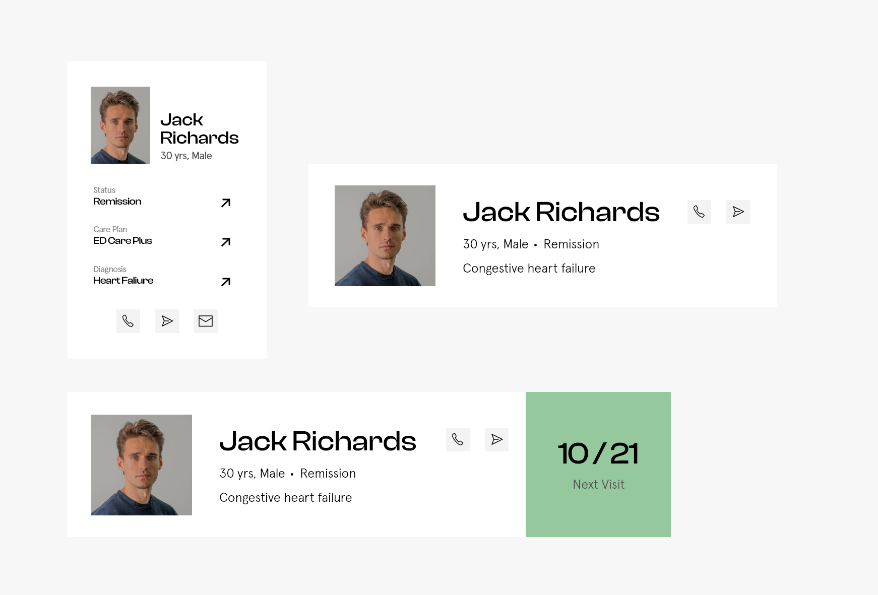
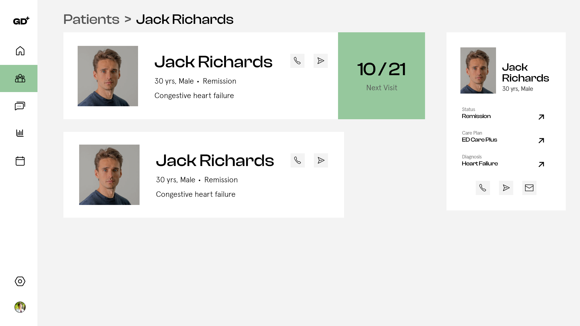
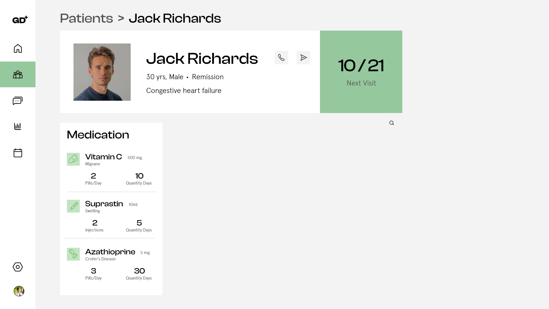
The Detailed Patient Screen
The Patient Overview Card
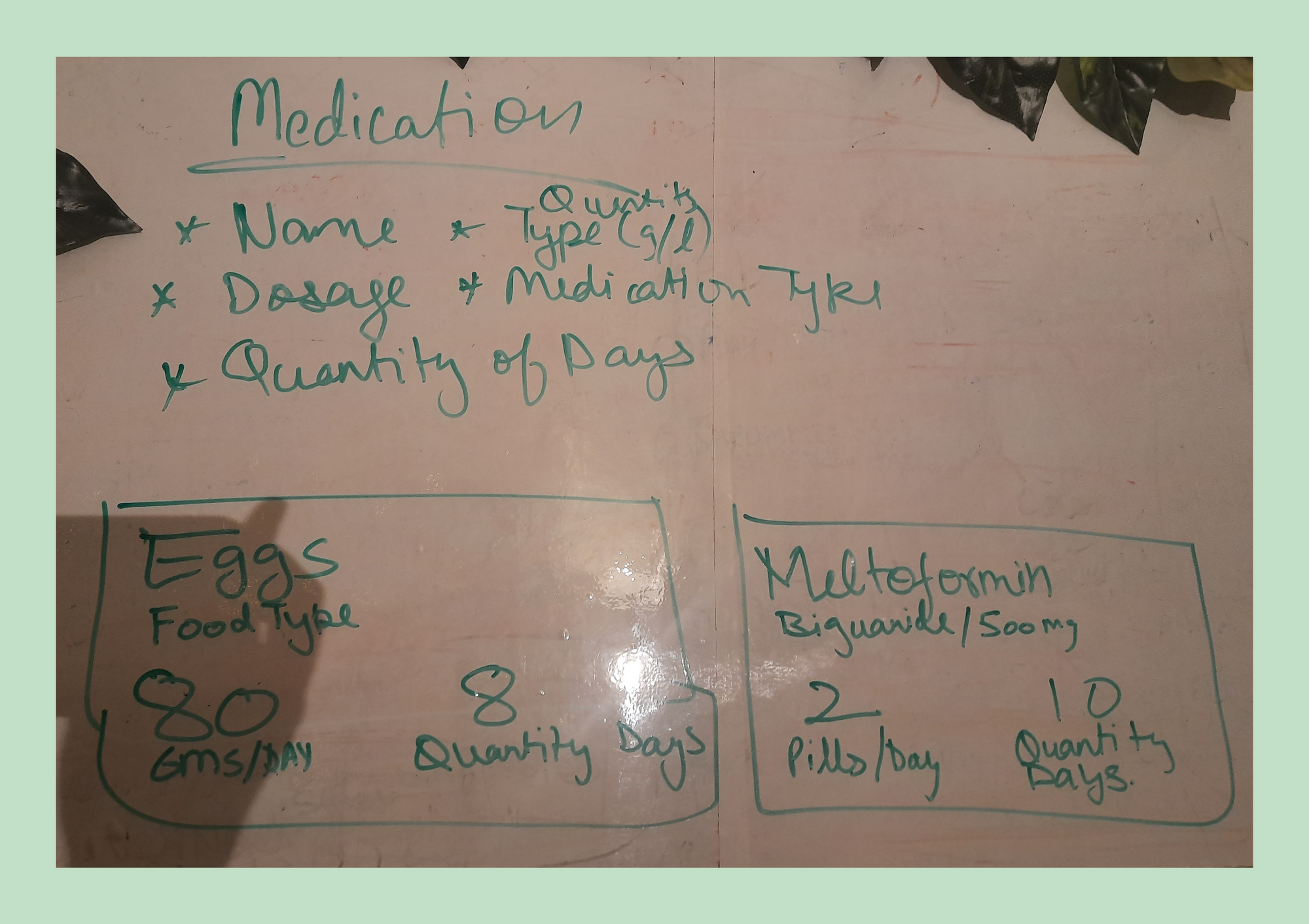
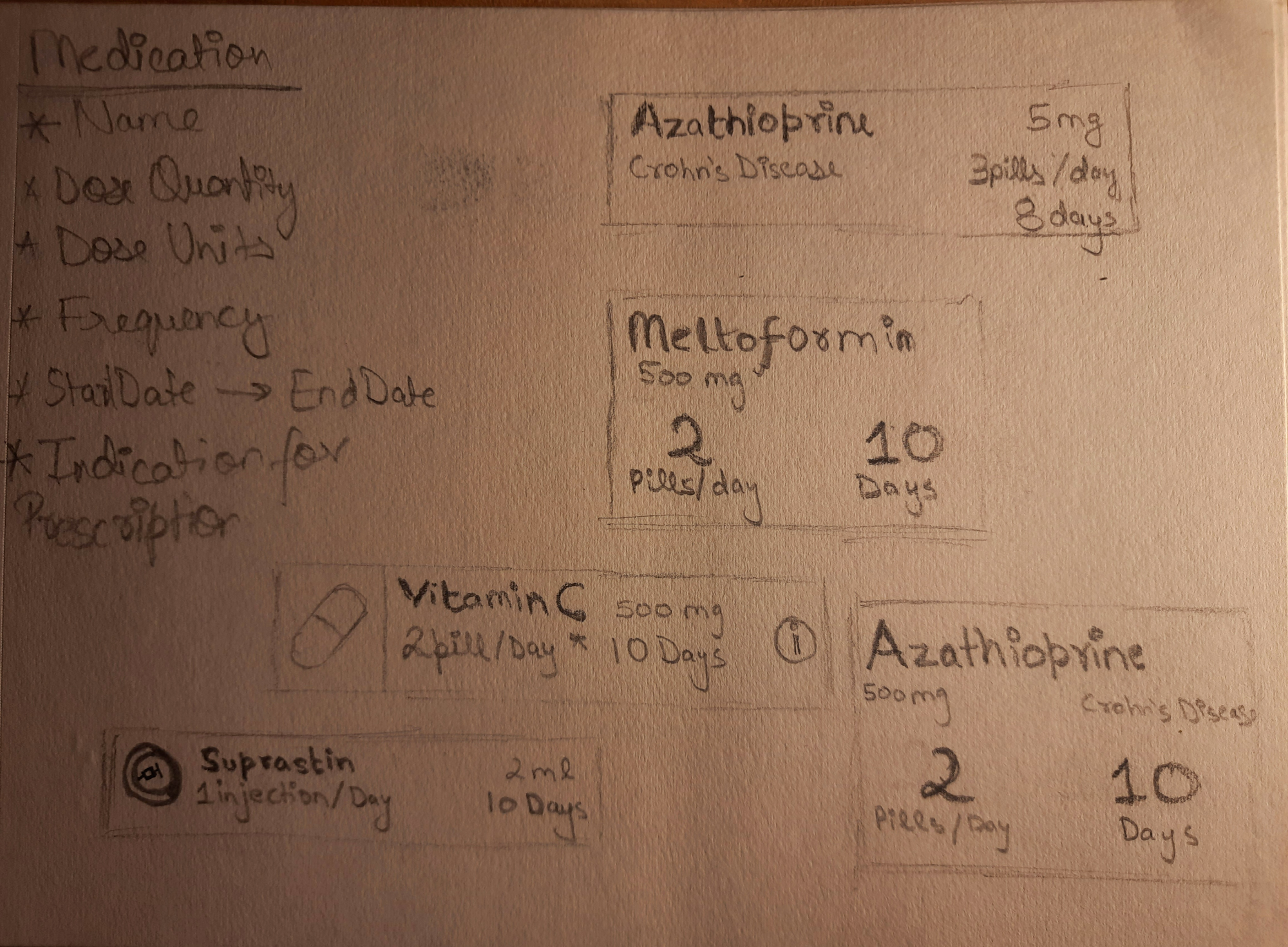
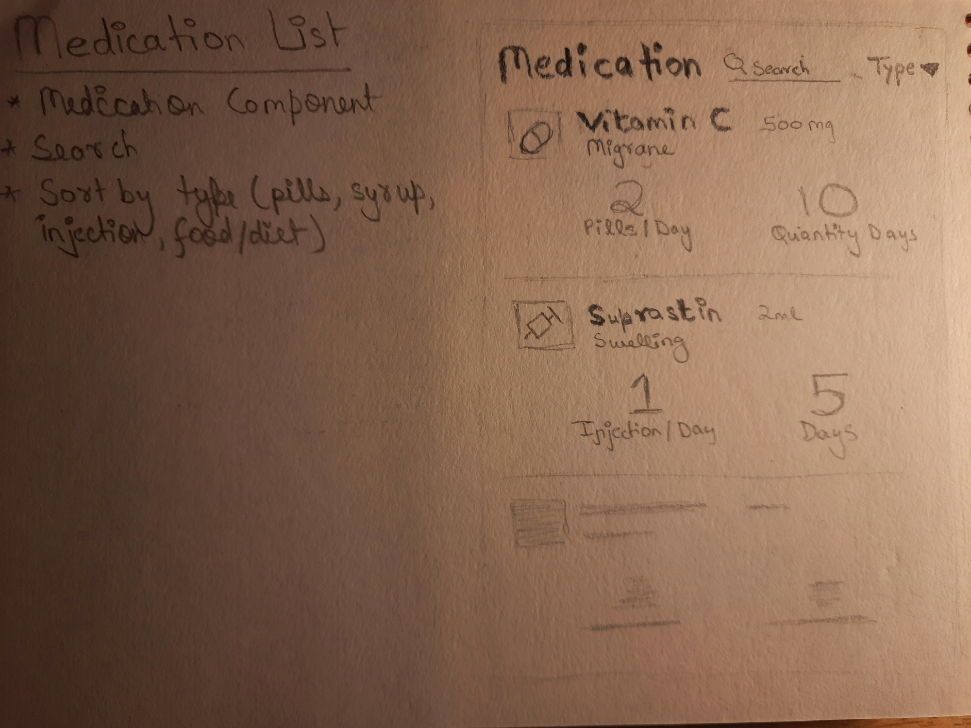
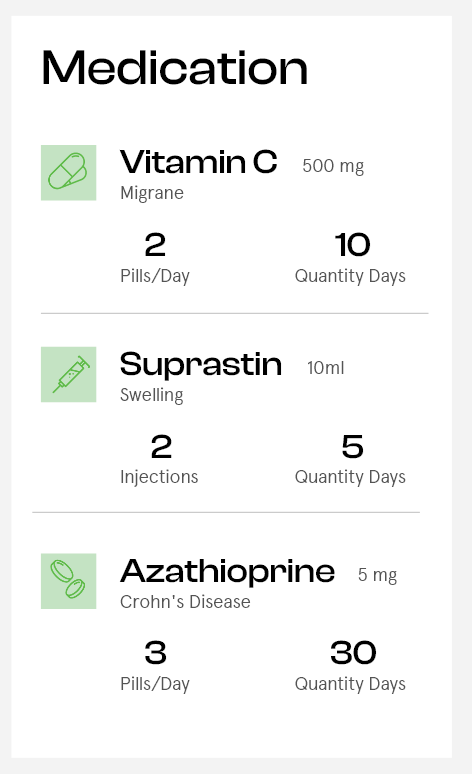
The Medication Card
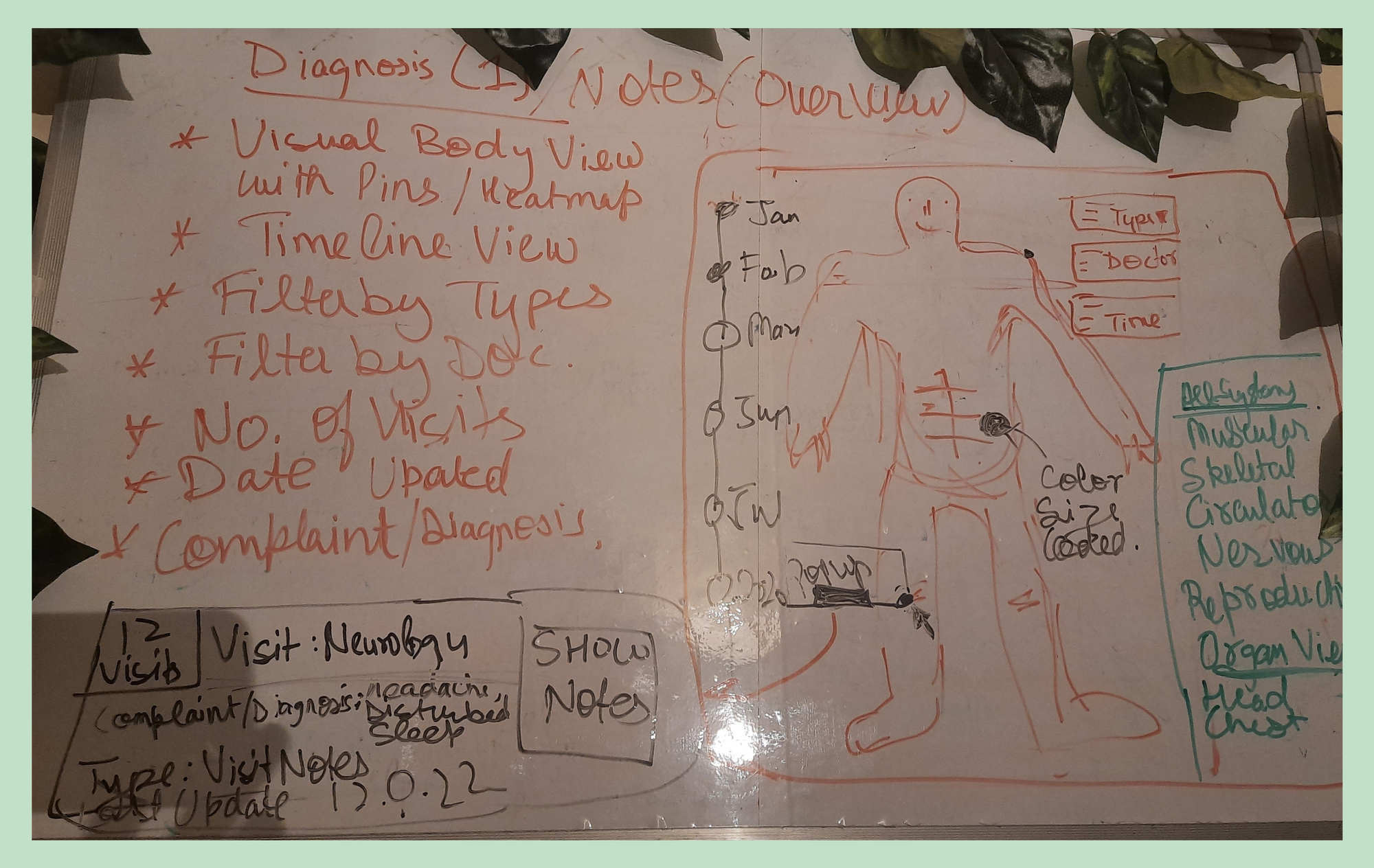
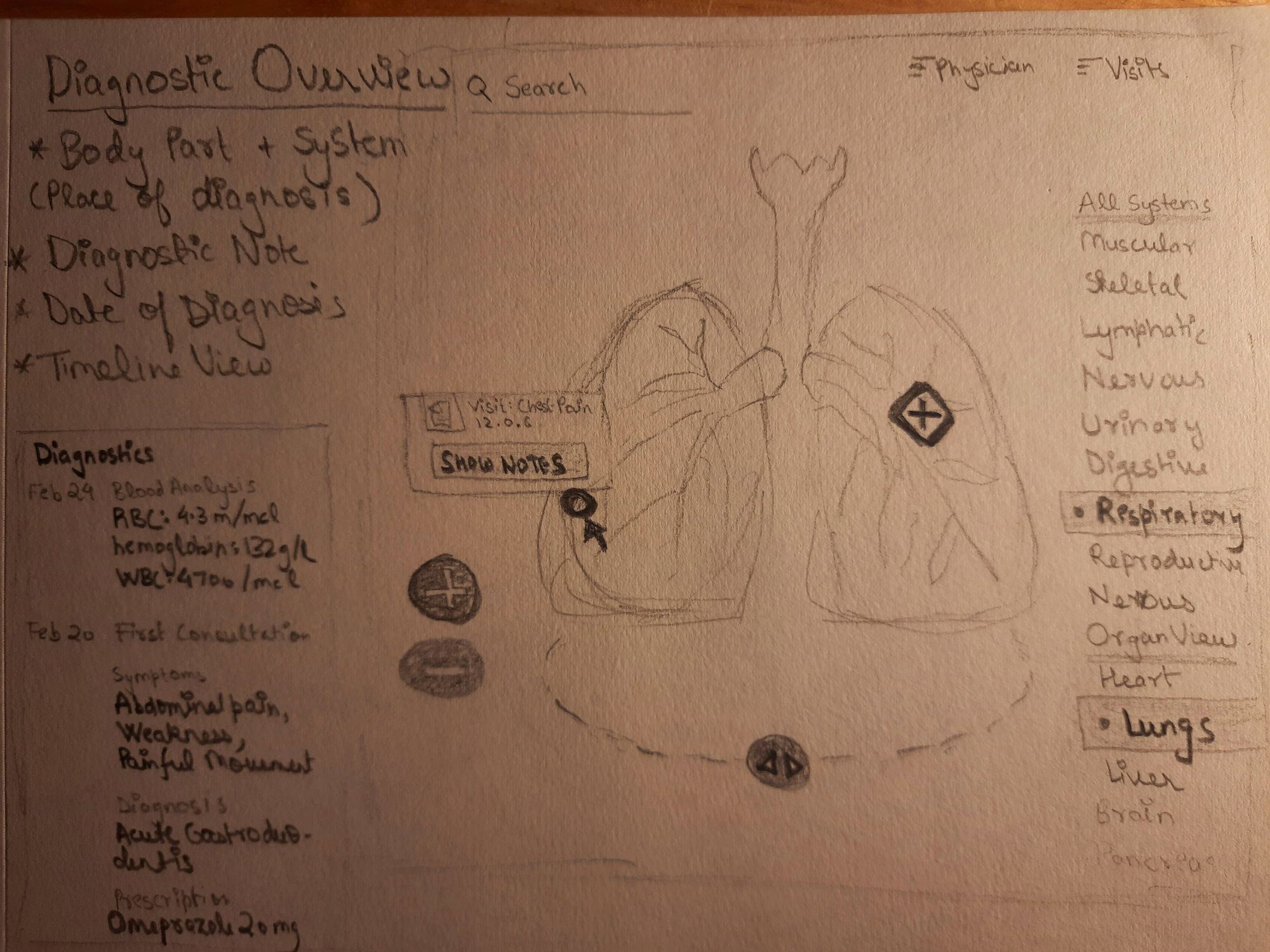
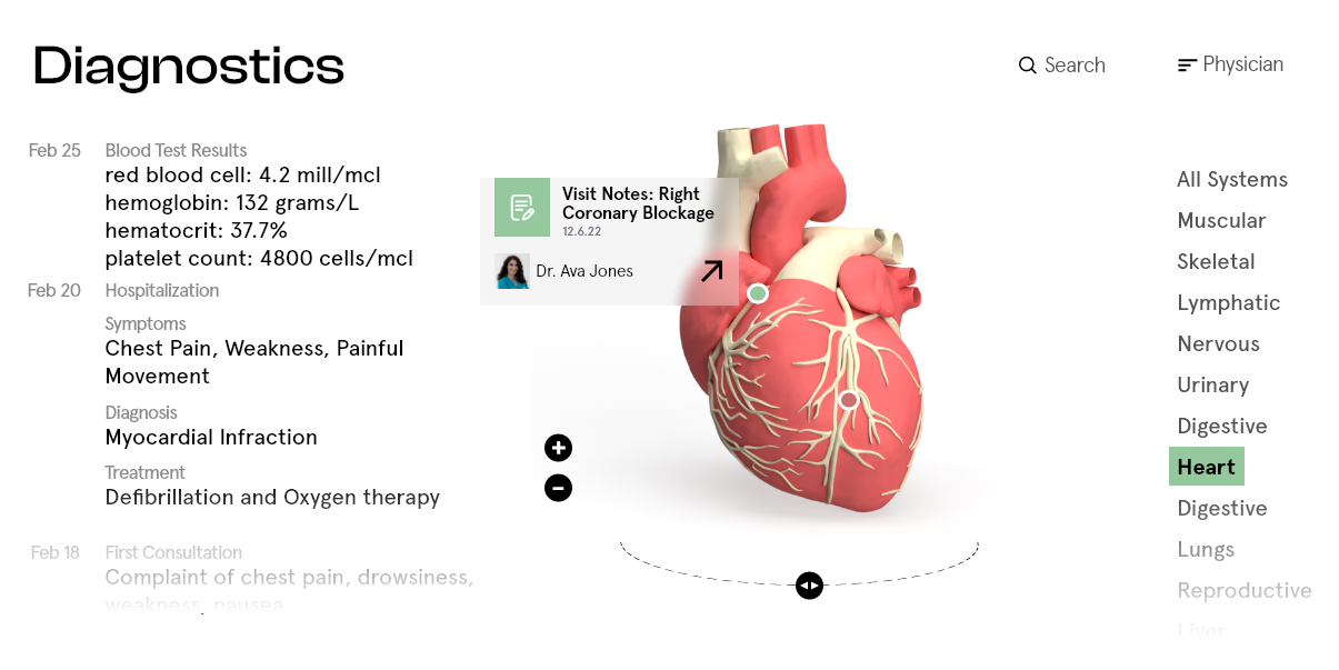
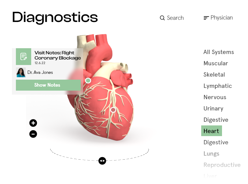
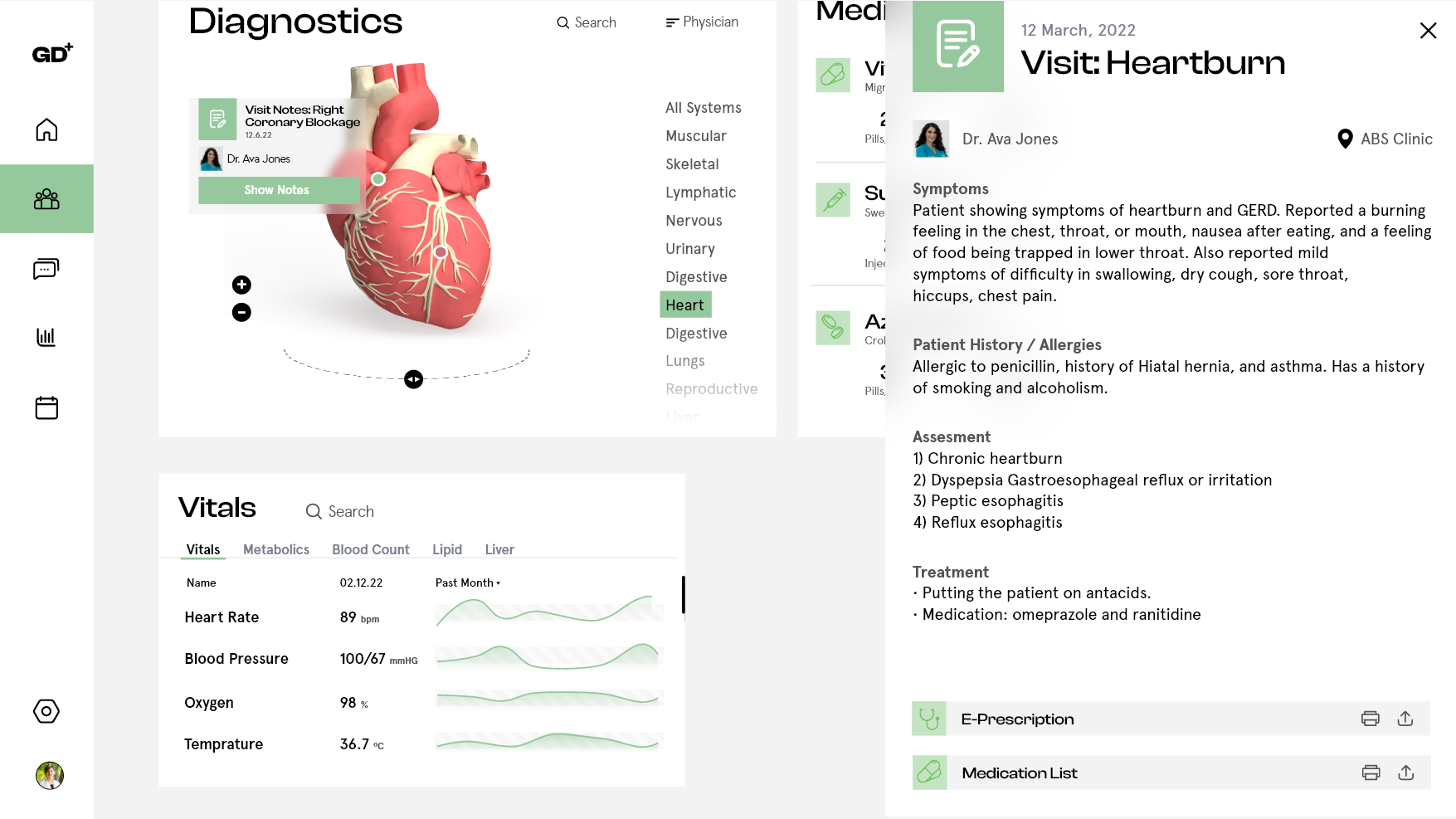
The Diagnostic Overview Card
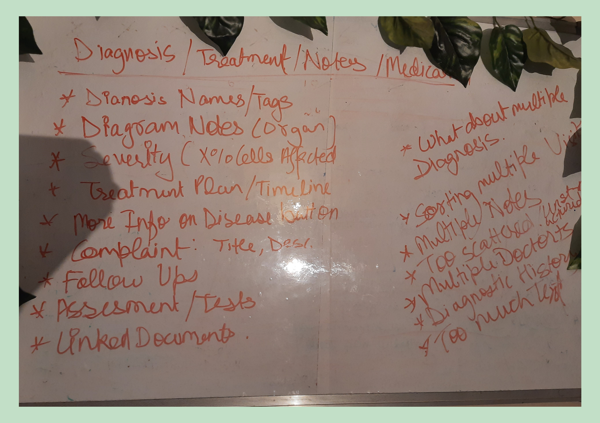
- The sketches that I was initially coming up with were just too text-heavy, I wanted it to be a bit more visual, something with a lot less clutter and more hierarchy.
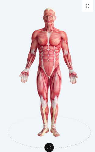
- Had to do a bit more research. Two things caught my eye and got me thinking:
- I think I now had some idea. I am gonna break it into two parts:
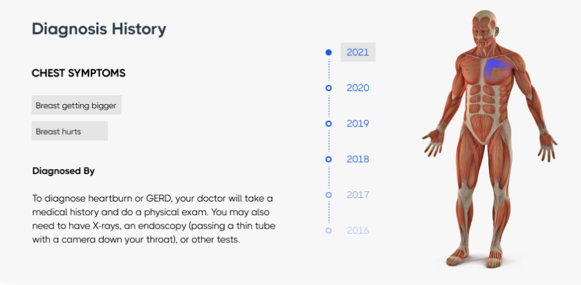
a) The Overview card, shows all the diagnostics visually as pins on the body area, and you can click on them to access the detailed notes
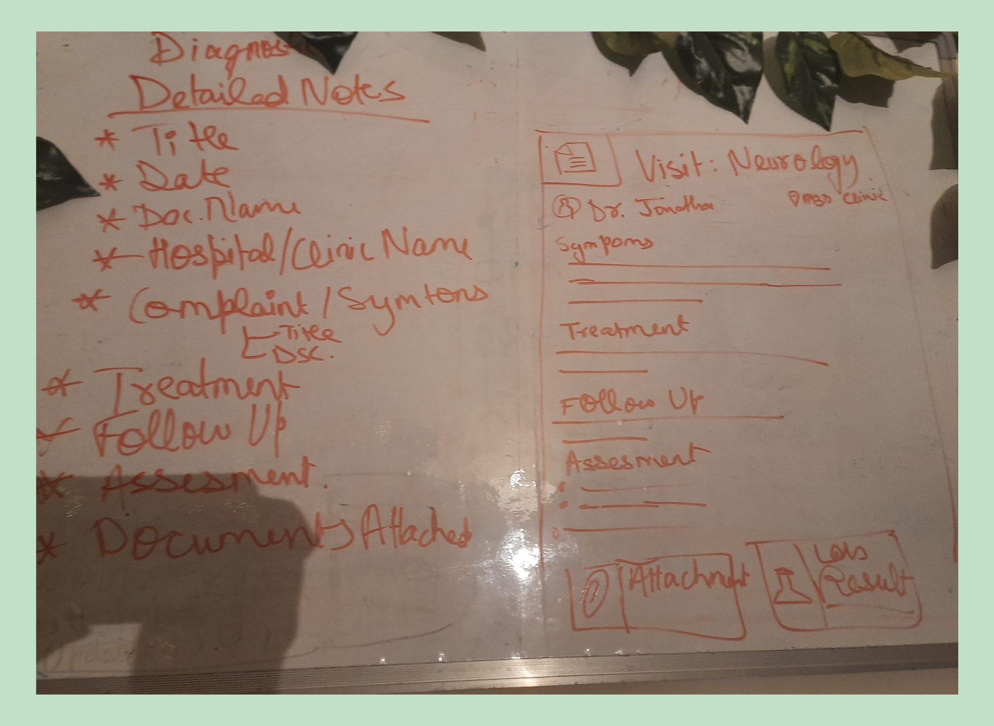
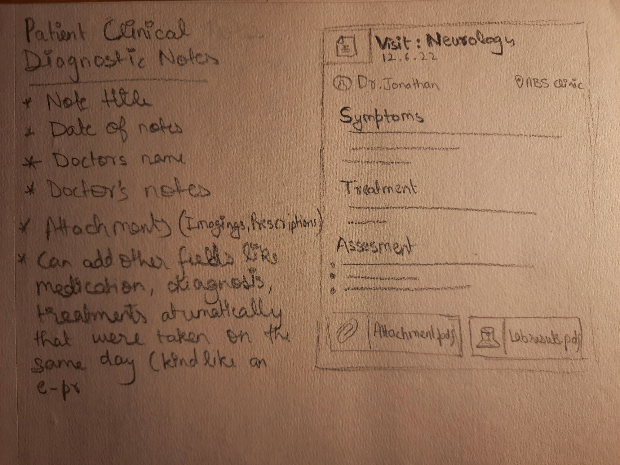
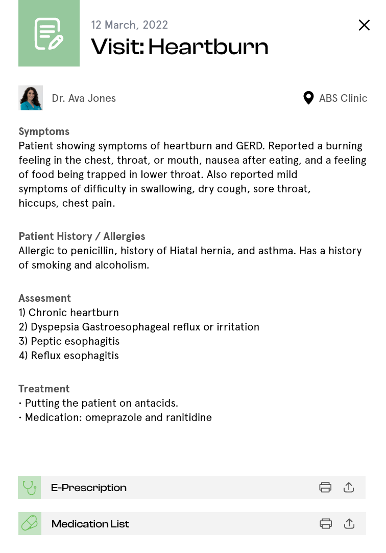
b) The Detailed Notes/Files/Docs Section
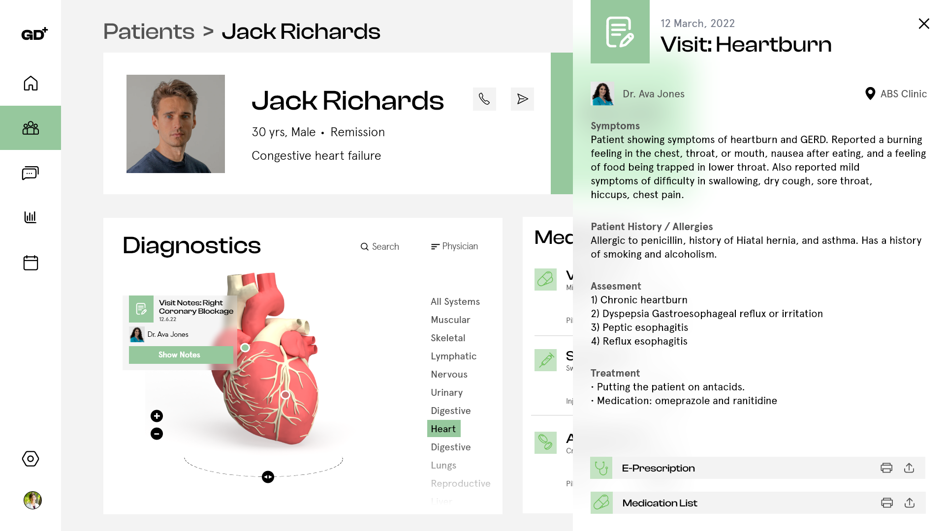
The Detailed Notes Card
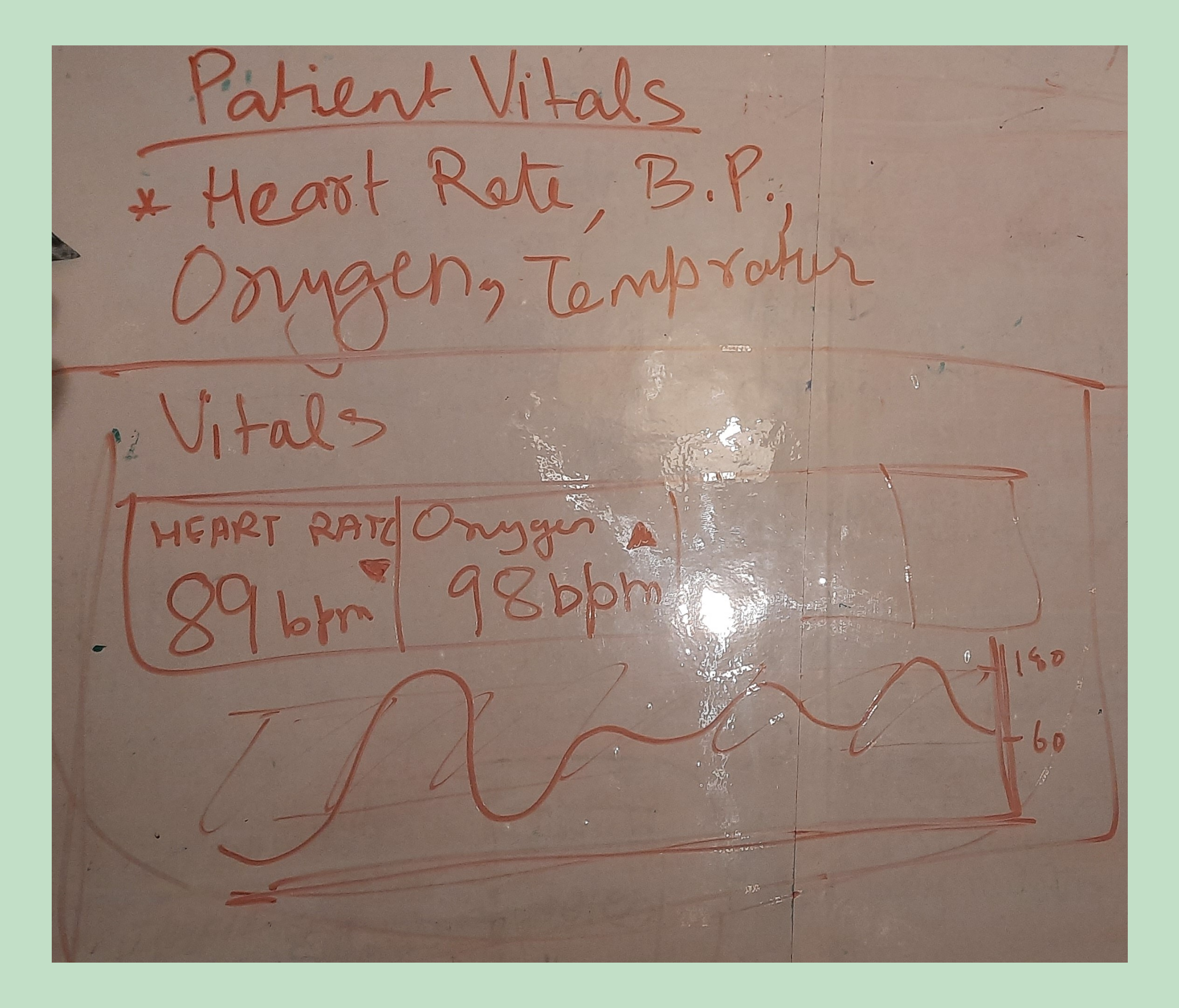
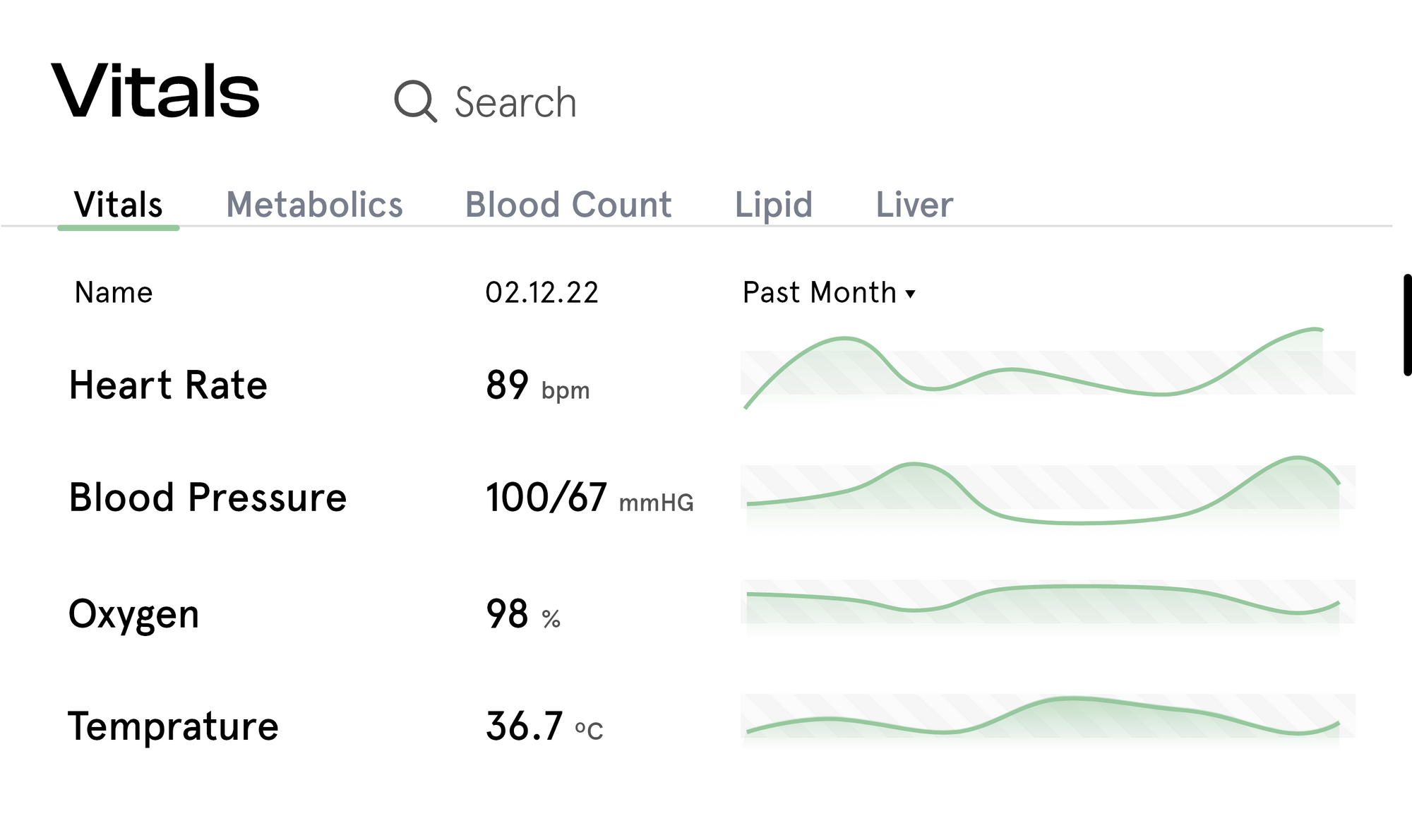
Patient Vitals
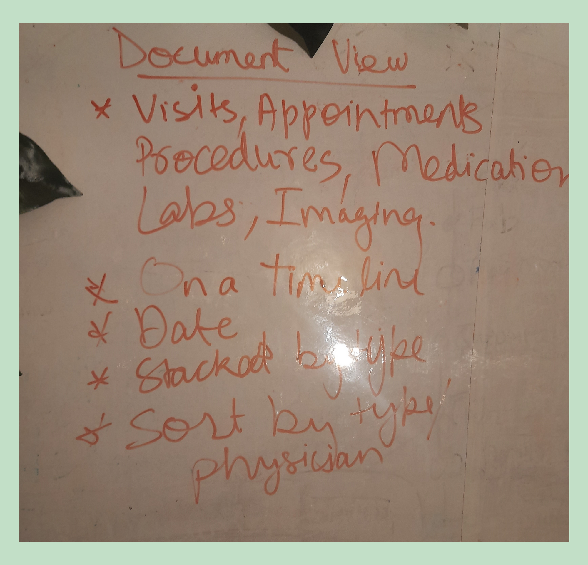
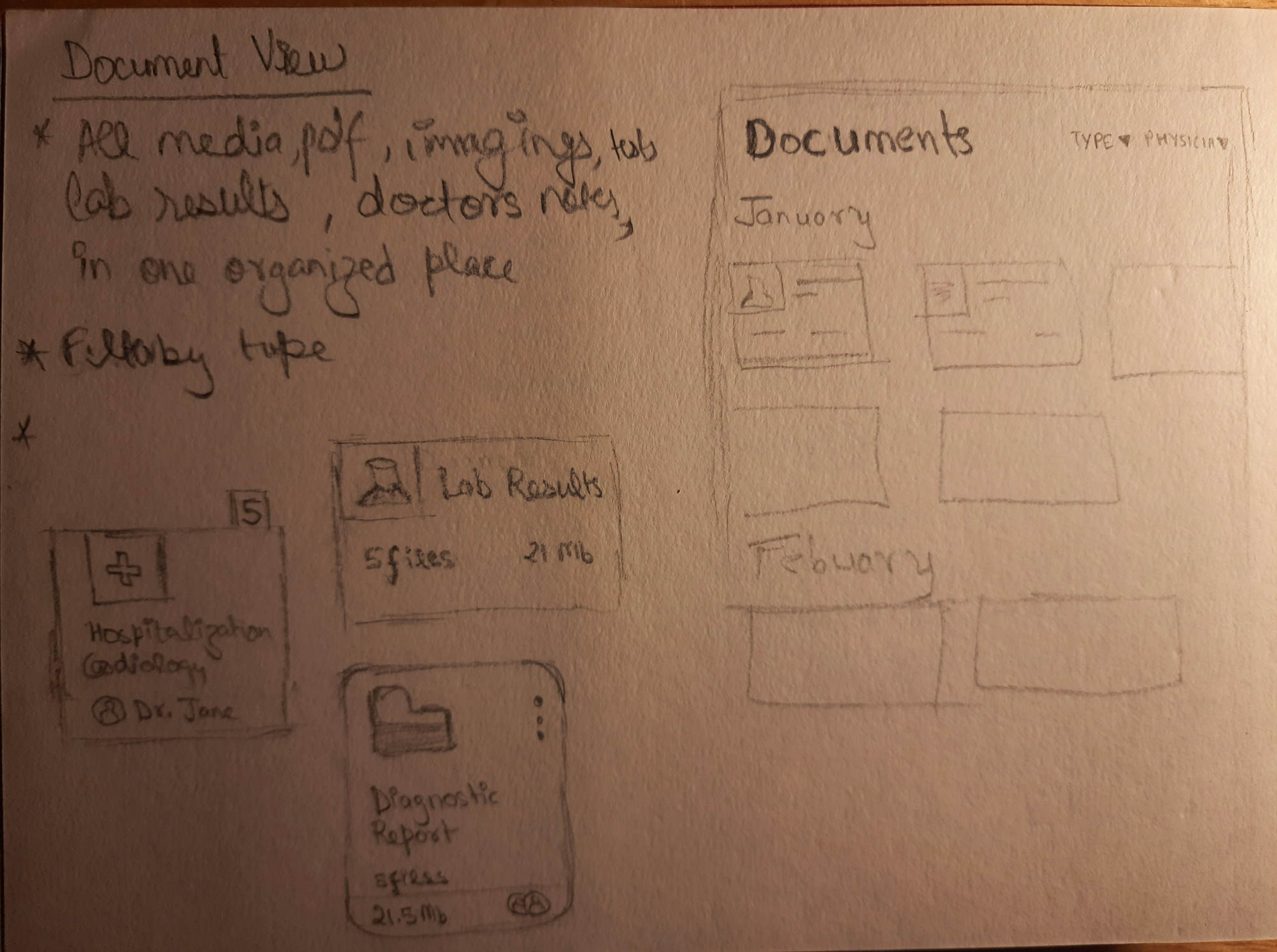
Document View Card