Site Animations Breakdown
breaking down the animations used on stewartpartners.studio
Okkk so this is blog is basically a written down version of the presentation I did @ project share last week.
Today we'll be breaking down the GSAP code that went into the building the animations on this site as I simultaneously eat the leftover Chinese from the takeout container, that is my dinner for tonight.
Looks very demure, very mindful, very minimalist & clean innit? (I still have no clue what this "demure" word means btw)
Anyhow moving on to the first animation we could see here:
1) Slide over animation
Now there's multiple ways to do it, here's how GSAP did it in one of their demos (which is honestly a more efficient way to do it):
But on the site, here's how it's done on the site:
As you can see there's this div called .home-hero_spacer that sits on top with a height set as the viewport's height and as you scroll down that height basically goes to zero. Here's how it's done:
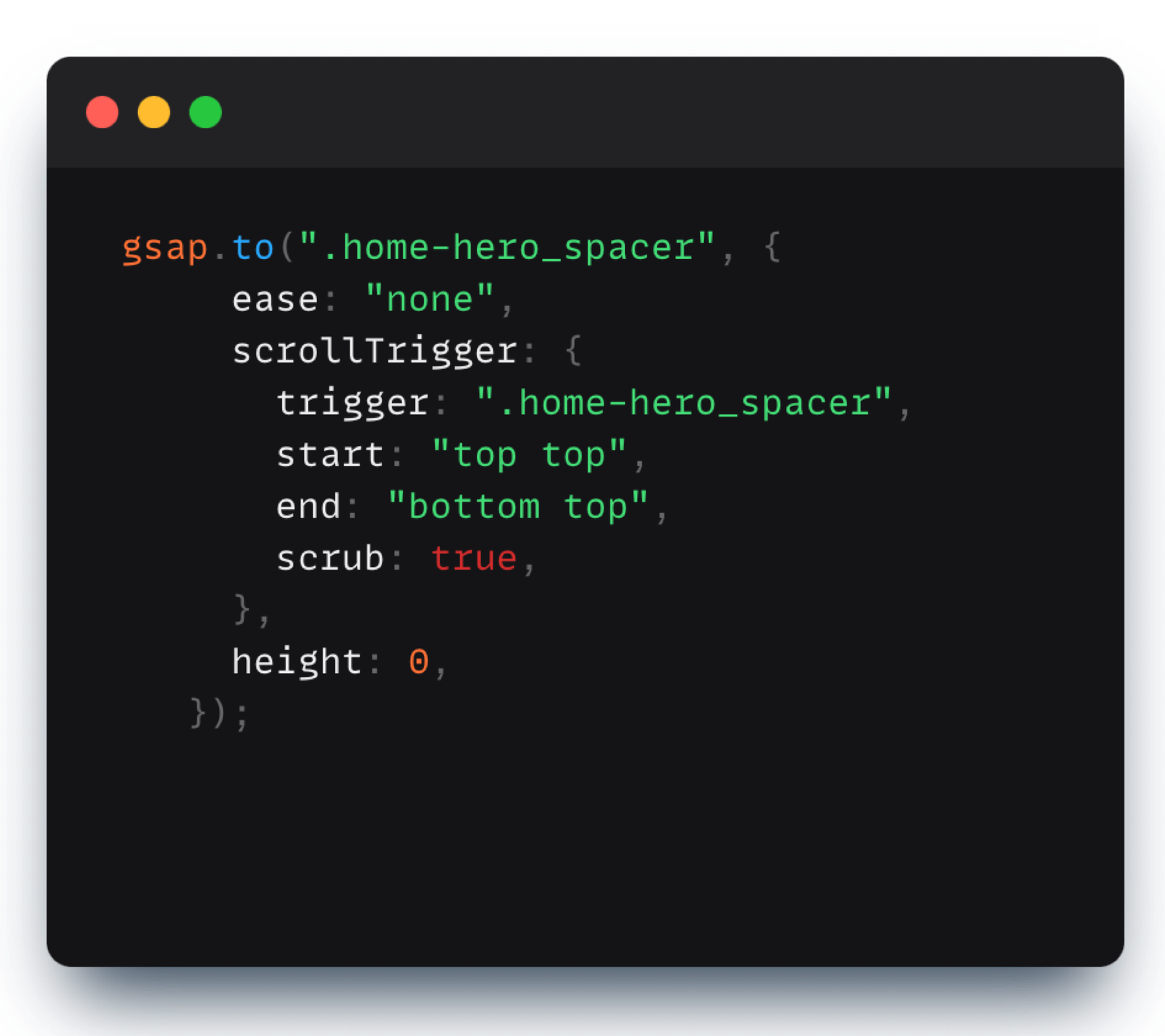
What's happening here is that as soon as the "top" of the .home-hero_spacer div hits the "top" (or 0%) of the viewport, the animation starts and its end point is set as the "bottom" of the .home-hero_spacer div hitting the top of the viewport. So that is the space in which the height translates .to "0". The "scrub: true" here just denotes that we want the whole animation's progress to be synced to the scroll.
2) Scroll Fade In's and Fade Out effects
Coming on to the next effect. It is a small tiny effect that honestly ends up being used in a lot of sites to change the opacity of an element as you scroll in or out
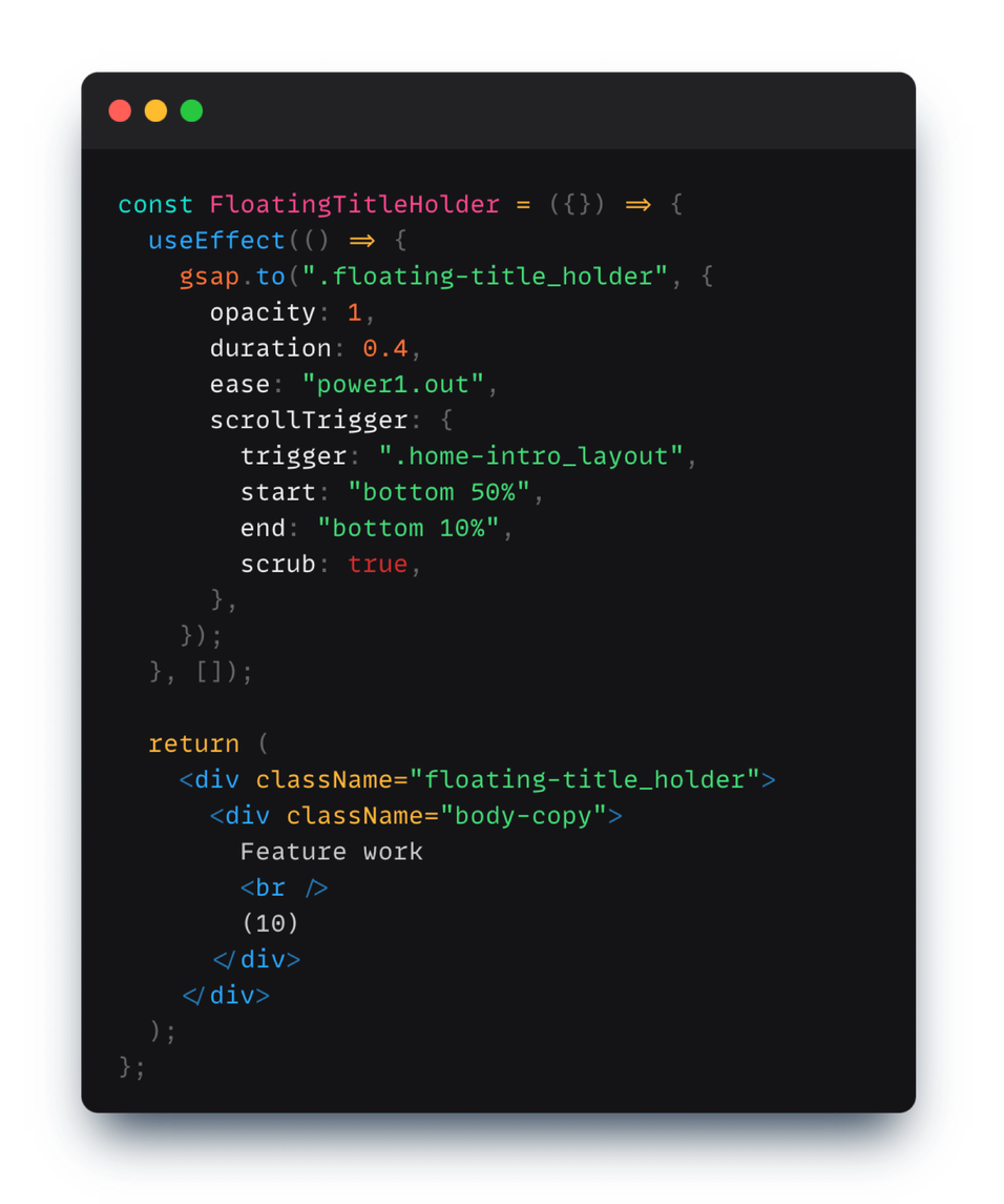
Again it's pre much the same as the last one, just that here we're "scrubbing" the opacity instead of the height. When the prev .home-intro_layout div's bottom hits the 50% of the viewport height, and finishes by when that same div hit 10% of the top of the viewport (look at the scroller start and end markers)
Here's the code behind it:
3) Gallery item entry animation
Now this one might look a wee complicated at first sight, but when you look behind it, it's a really simple stagger entry animation. The staggers entry is randomized here (I did initially plan thought just doing a normal stagger where it's the first element first followed by the second with a slight staggered difference and so on and so forth but the randomised one seems more cooler in a "abstracty" kind of a way).
Again what's really happening here is that we're animating the y-percentage of each .image-grid_item from 150% -> 0% while we scrub through the .photo-grid_section. As you may see in the code below the value of "scrub" is set to a number (1) instead of true. By using a number we are just adding a slight smoothness/lag-to-catchup with the scrolling here. The higher the number, the more the lag.
The code:
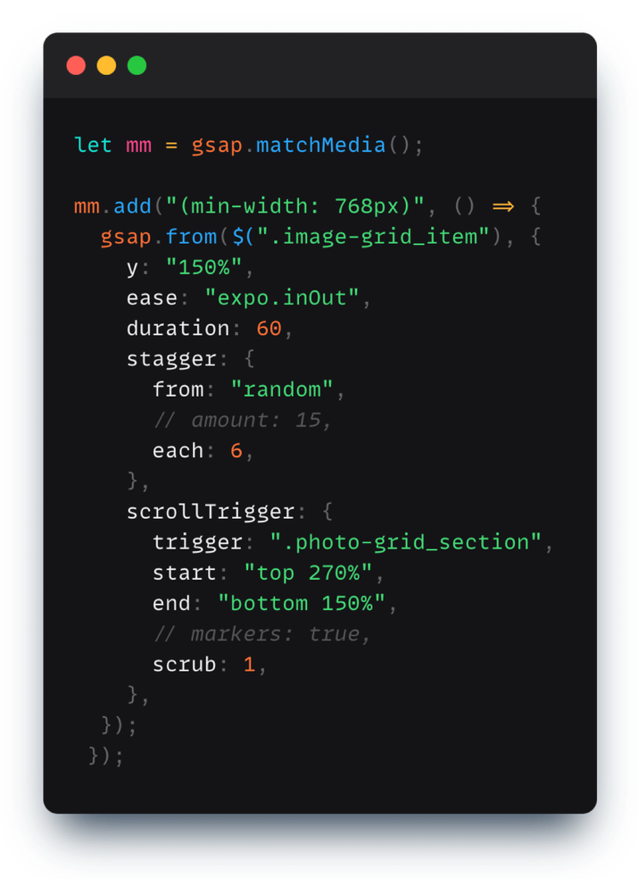
As for the "stagger :{...}" part of the code, what we're doing in it is that in whole 60sec duration of the animation of 10 items we want each of them to have a staggered difference/lag with the prev element of 60/10 elements = 6 sec indicated by the "each: 6" part here. And by setting the "from: 'random' " here we're basically telling gsap that instead of applying the staggers sequntially to the first element then the next and next... we wanna apply it randomly.
You should really look into the amazing staggers documentation that gsap has here:
4) Tile hover animations
Coming on to the hover effect added to the tiles in the photo grid section.
Firstly all the data we're using for each tile is just stored in the html and we're simply fetching it back when the user hovers over that tile:
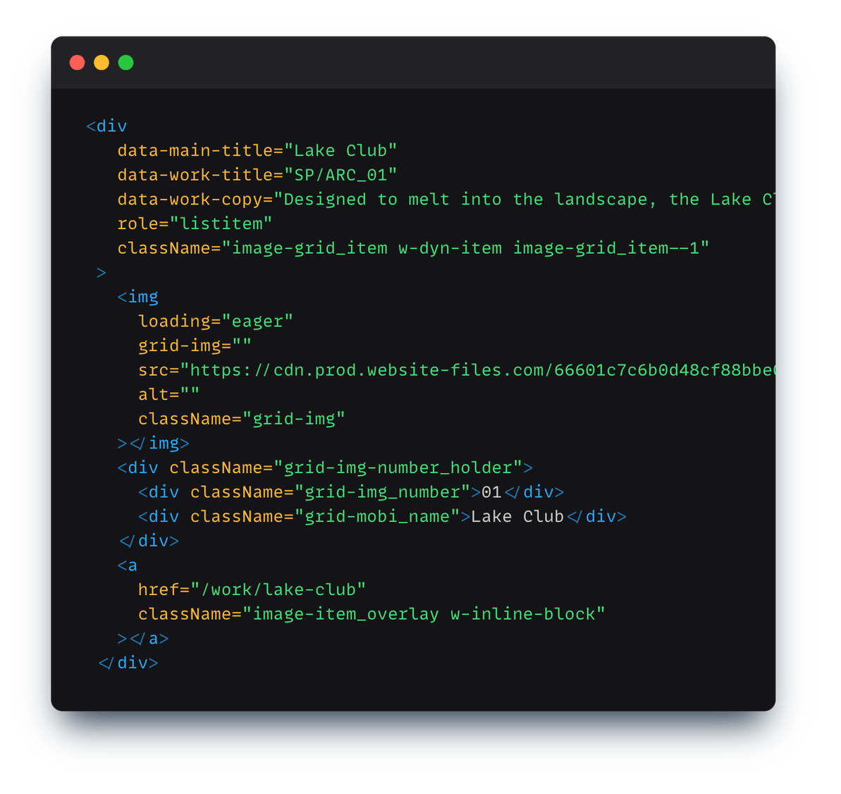
and in js part we're handling the hover effect:
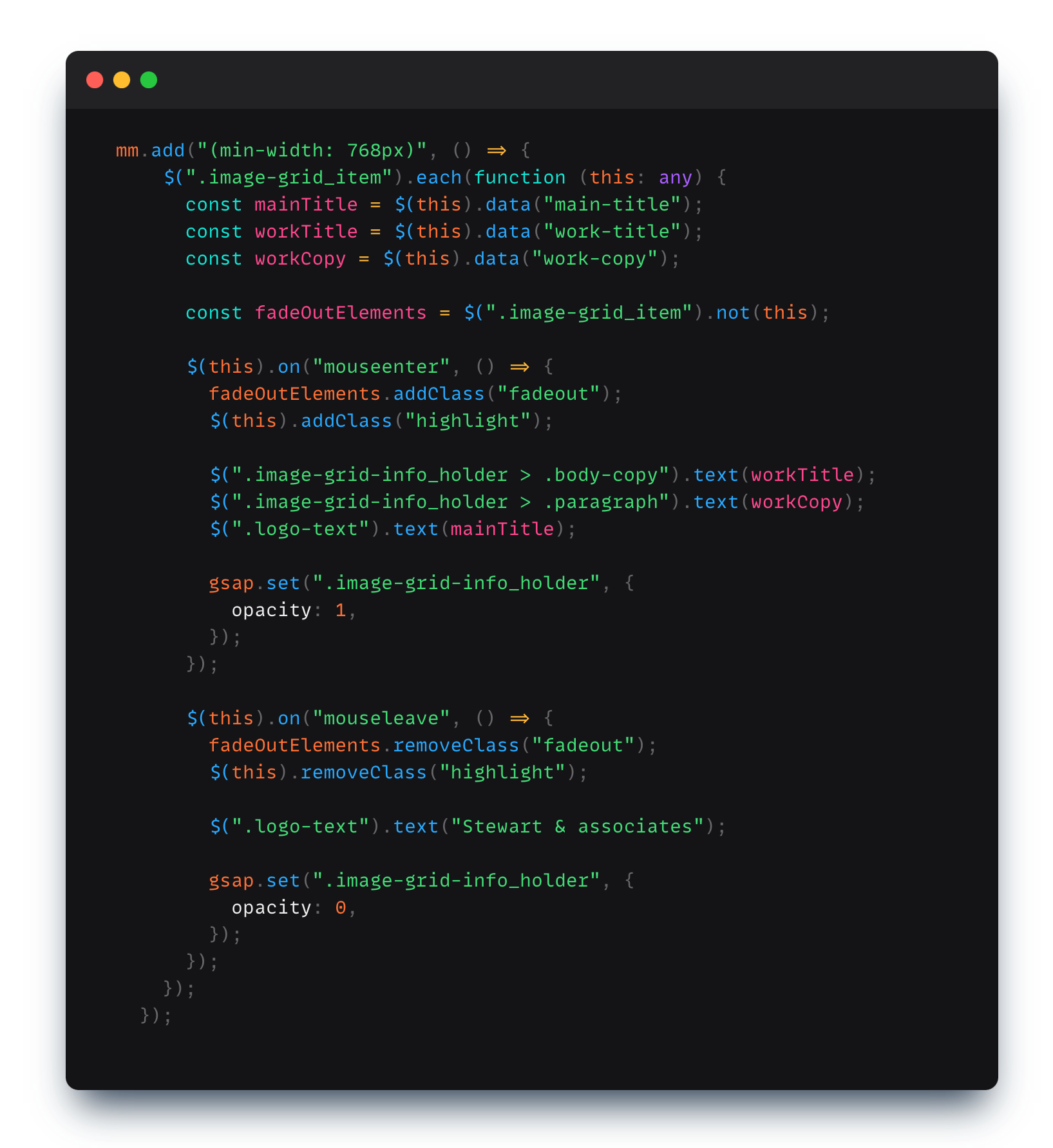
Again what's happening here is that:
- We're looping for each of the .image-grid_item's
- For each item we're fetching the text data associated with it.
- We're adding event listeners for the hover-in and hover out effects
- When the user hovers in, we set the text in the dom to the fetched text for that element and also activate the highlight class which activate the small css number slide in animation you see
- When the user hover's out we remove the active classes and set back the text to it's default state.
5) Gray-scaling and Fadeout Effect
Now the last piece of animation applied to the photo grid is the sort of "disabling effect" as you scroll down to the footer:
Again it's pre simple:
- First we set the scroll trigger part of the whole animation adding the triggers and the start and end markers and setting scrub to true. Additionally we're all so using the "onEnter" and "onLeaveBack" callbacks part to activate/deactivate the hover effect on the photo grid tiles by adding a classname
- Then we say that we want the text holders to disappear as we reach the bottom
- And lastly we apply a slight css grayscale property and a slight dimming of the opacity effect to have that disabled look.
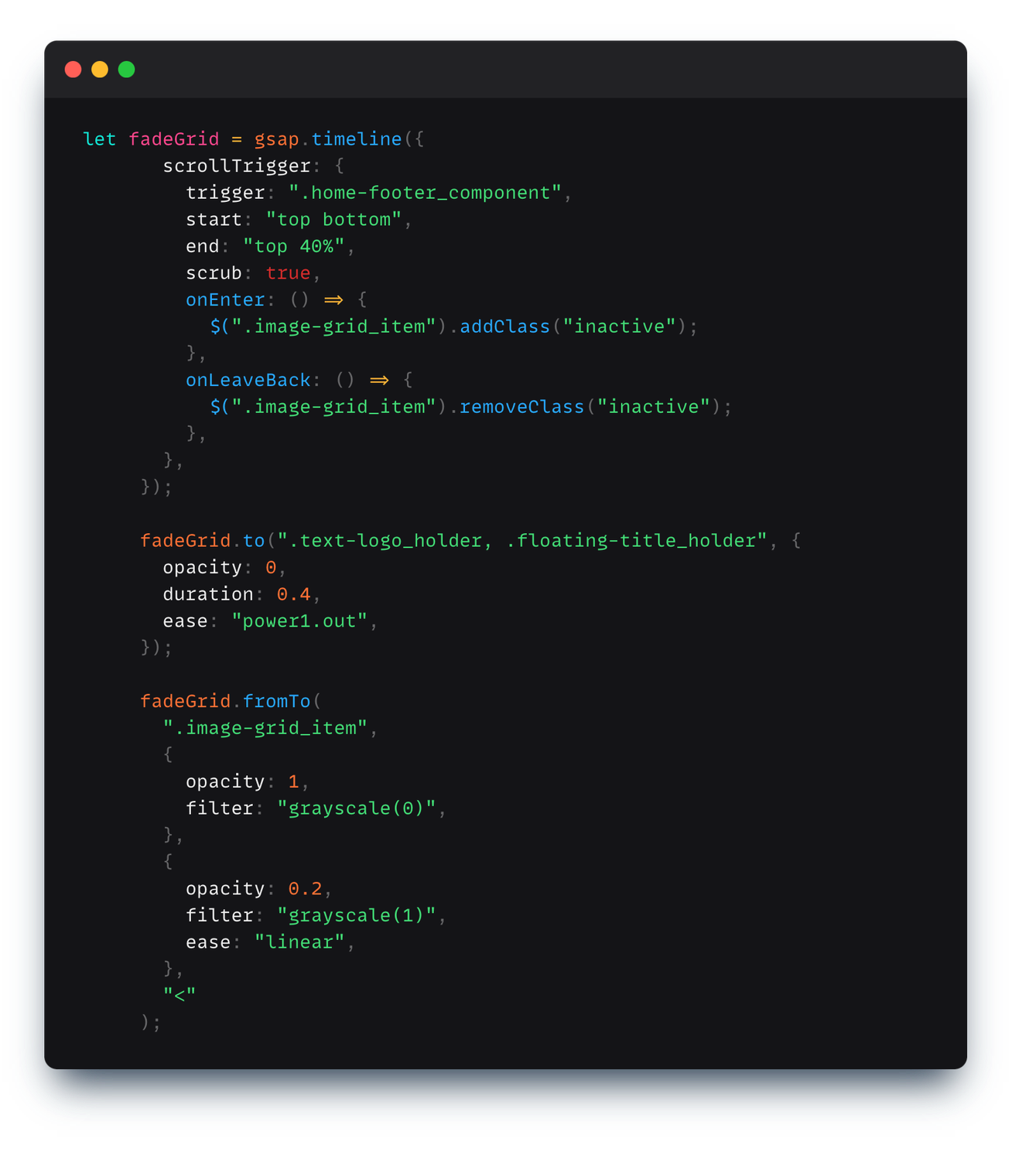
If you're wondering the "<" part here basically means that we want the effect's starting time on the animation timeline to sync with the previous effects starting time.
6) The text hover animation
You might see this same hover animation applied to text links throughout the site.
To do it we basically have two .h-item's divs whose text will be animated, wrapped in parent h-effect div which sorta masks and just let's you see only one of the lines inside it:
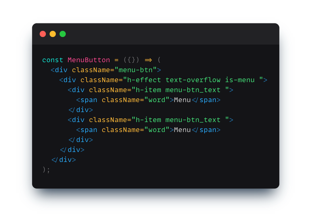
And in the js part we just fetch all the h-effect divs throughout out the site and add the animation to each of them:
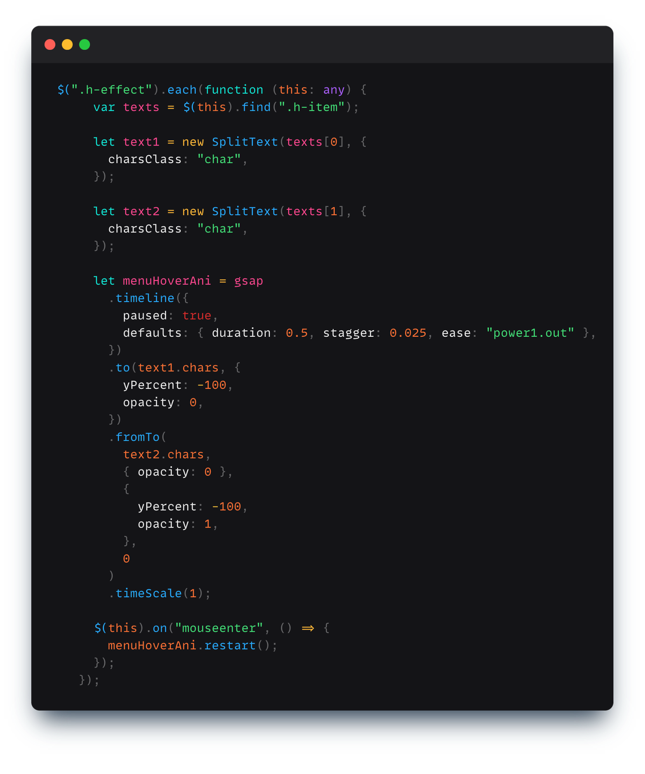
To break it down further what we're doing here is, we' using GSAP's SplitText to break apart each word into sep divs containing each character, which sorta looks like this:
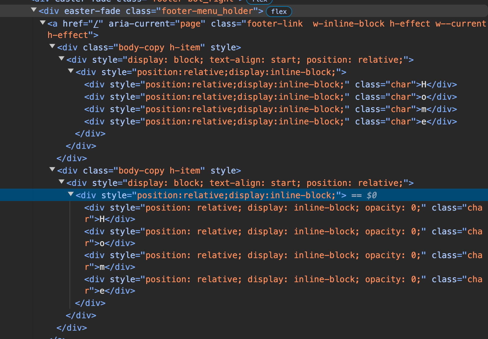
and then for the first h-item tag we're translating each char to -100% with a lag of 0.025 secs between each character and fading them out while we do the same for the bottom h-item element's characters but just fading them in.
Also notice in the code how we used the "default:{...}" tag to specify the stagger amount and the total duration of each animation since it's pre much the same no.'s for both text1.chars and text2.chars
You could potentially create a lot of different text animations by just changing that duration and stagger amount:
Here's that codepen btw:
7) Lottie Animations
Lastly here's how some of the more complex animations are done in the site in a not-so-complex-might-be-cheating way:
So there's this thing called lottie animation that are basically very complex animations done in a much more size efficient way instead of using .mp4 or gifs.
So how it works is that you have what you wanna animated done in after effects, which is much simpler than doing the same thing in code. You then using the plugin called bodymovin in AE to export it as a .lottie file which is essentially a bunch of json. And then you can use the lottie-web npm library to display that animation on your sites in a simple way like this:
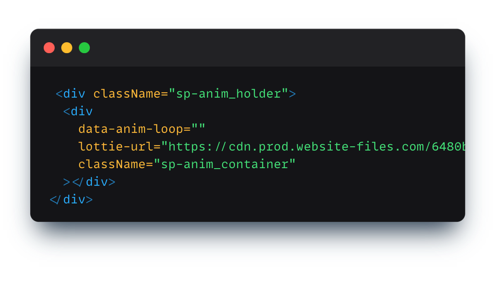
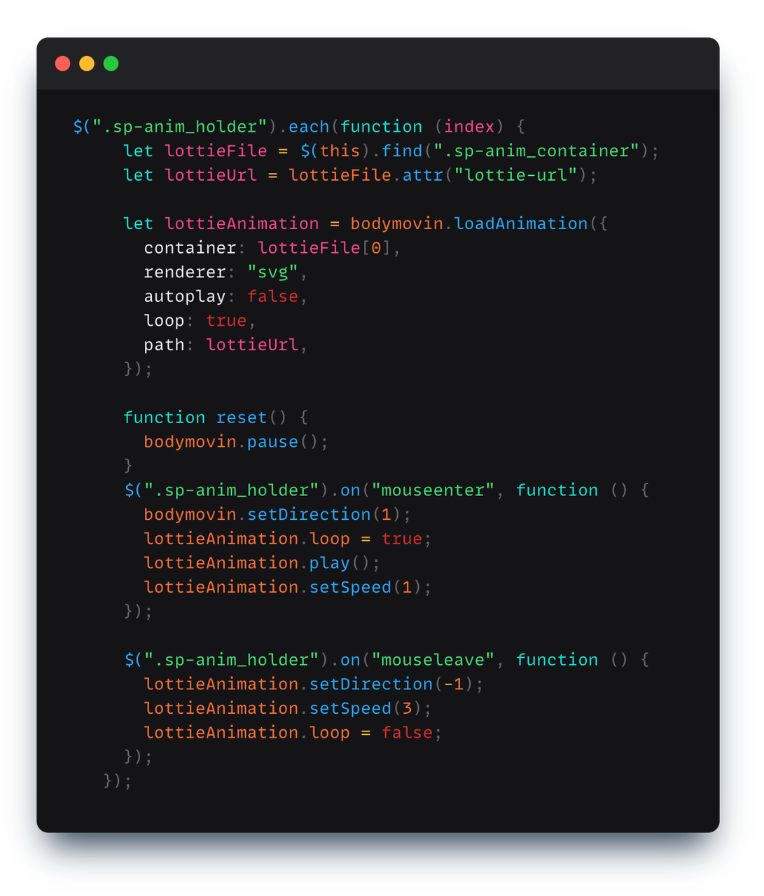
I mean the code is mostly self explanatory so I won't go into it. It's just pre much loading that lottie animation and then controlling how it's played.
You could potentially do the same using GSAP too, I mean it is just essentially a timeline of moving those points in a set order to create the effect, but lottie is a much more simpler and intutive way of doing them when you feel lazy.
With that I think I'll conclude this one as it's sorta gotten too long but I just wanted to show you how just adding some simple animations in your site can make it so demure.
Happy Sunday ahead to you! [Superb yawn] Maybe I'll do one of these breakdown things again for other sites too if I find time from all the cooking, cleaning, emailing, hw’s quizes, lecs, part time gigs, grocery shopping that I have to do now that I have decided to go the more "independent route" and not live in a catered-uni-accomodation this year. Honestly growing up sucks. I wanna go back home already. If you've got any tips on navigating adulthood, do lmk lol.
Anyhow, seeya!
P.S. - As usual, you can find more intel on my @ itskay.co. And feel free to hmu @banbury_cheese on insta/twitter if you wanna chat or use hey@itskay.co for more profesh stuff (side note: I'm not taking on any more gigs atm, my basket is sorta full of eggs, but do hmu and I'll see what I can do for you :)