Kay how do I do stylescapes?
Moodboards are dead. It's the age of stylescapes now.
Mini Disclaimer: These are my course notes from a course that I took. These notes are just meant to serve as a reference for the people that I work with and my clients. Because unlike me, people don't spend all their weekend and money binging courses they found on the internet. And they just want a summary. So here it is:
What tf is this stylescapesy thingy?
In a sentence, if I had to sum up: Stylescapes are the bridge between design thinking and visual design.
So you might have often come across the problem, that every time you have to move from something familiar to something new there are three things that happen:
- Lots of anxiety and Xanax pill popping involved.
- Opaque process because a lot of designers (including me) design behind a 10-foot steel walled creative black box and the client doesn’t know what voodoo or dark magic stuff they do while designing or how you came up with what they came up.
- Guessing, a lot of it: Is it what they want? Will it work for their customer base? Should I move this text upward by 10px…
What’s happening is that when you go for the big reveal and you don’t take intermediate steps to get there that leaves a lot of questions, and it leads to one of the two outcomes:
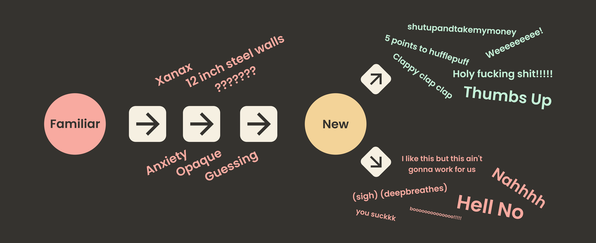
There is a lot of friction when you move this way from Familiar → Knew
Solution?
Perpetual Alignment (fancy term for scaffolding (fancy term for moving step by step))
Old Way
Does this look familiar?
- The client reaches out to you in PANIK! → Sudden Emergency → Brain dumps project info
- The client answers your generic questionnaire → Unclear and abstract objectives → Start Anyways (Because you think you can do it)
- “Research” To Get “inspiration” (you exactly know what the double quotes mean here)
- Present → Client Is Unsure → Get V.Vague Direction
- More Design → Present → Get V.V.Vague Direction → Client Becomes Art Director
- Repeat X Times (Stuck in revision hell) → Enter Dark Night Of The Soul
- Surrender → Finish work behind schedule and over budget → Compromised work
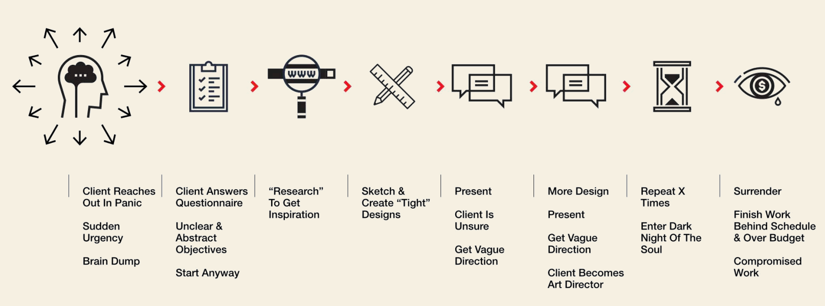
The result?
I want mommy.
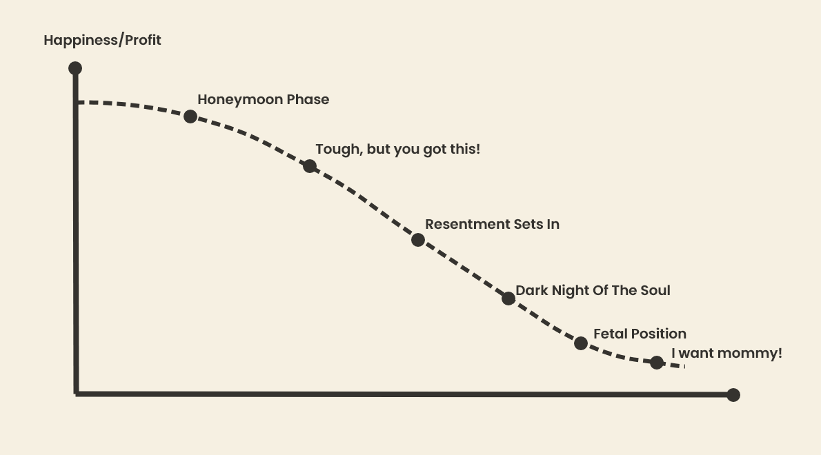
Where did it go wrong you asked?
( Science warning )
The limbic brain to be precise. That’s where it went wrong.
Your gut/limbic brain drives many of your decision. It’s what happens when you describe “something doesn’t feel right”
This part doesn't have any language to describe why you feel and what you feel.
The Solution
Rather than feeling frustrated when clients describe feelings, learn to translate those feelings into words.
Lemme throw in a Socrates quote ( gleaned from unverified sources ) for extra motivation:
The secret of change is to focus all your energy, not on fighting the old, but on building the new.
Feel Motivated…?
The new/hippy/preferred way.
- Tap into the gut feeling.
- Translate this gut feeling into words.
- Prioritize / Shortlist the words
- Translate words into images
- Get agreement and shake hands the Viking way
- Rapiiidddd Prototyping
- Refine Refine Refine
- Delivery: Nailed it, Screwed it, Hammer it, and Shipped it. (why does it sound like an IKEA slogan) Also, don’t forget to add the instruction manual.
- Call in sick for the day and go to the museum, maybe even have a Tootie footie if you’re feeling adventurous ( optional )

The Result?
UP UPP UPPPPPP
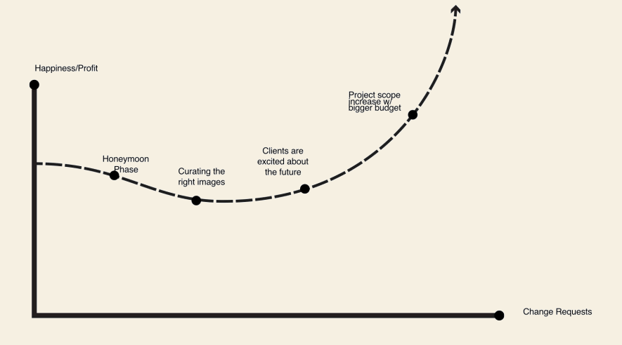
Once you present this way, all your problems in life will go away ( well not all of them to be precise ) ( but a teeny tiny fraction of this mess that you call your life will start getting a bit less of a mess. )
Cut the bs Kay, how do I build them?
Well I have to add here that stylescapes are a small part of the whole “brand strategy” thingy.
I mean there are a lot of things that are done in it like user personas, brand attributes, goals, prioritization, conversion funnels, competitive audits and nerdy shit like that.
But as far as this is concerned it comes with the band attributes thingy.
Step 1 - Brand Attributes
- Start by describing the brand (desired future state) in terms of voice, tone, look, & feel.
- Narrow down the list into 3-word buckets like: “rustic, authentic, and industrial” or “vibrant trendy and comforting” or “Historic Refined and Glamorous”
Step 2 - Image Buckets
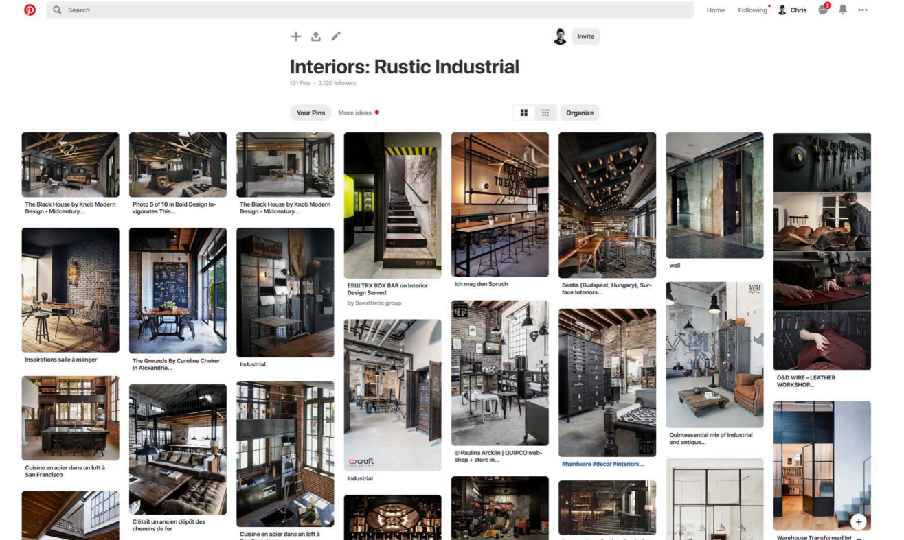
- Take your 3-word bucket and start entering them into these websites: Pinterest, Behance, Dribble, Shutterstock, Unsplash, Creative Market, DeathToTheStockPhoto, Pexels, Gratisography, Life Of Pix, Split Share, Stock Snap. (overwhelmed…? just choose the first 3) (and no I’m not gonna hyperlink them, believe it or not, I too have a life)
- What do you have to search for? People, Environments, Packaging, Lettering, Colors, Textures, Architecture, Interior, Typography, Illustrations, Photograph, Color Grading, Objects, Identity Systems, Way Finding, Fabrics, Symbols, and Icons. ( still wanna ask, “Kay What Do I GOOGLE…?” )
Step 3 - Empathy Mapping
- Get your soya milk, pop in the straw, sippp. Then rub your imaginary beard and Empathize… Empathize Intensly. V.V. Intensely. Think what would your users life is like. Does he too drink soya milk? (optional step )
2. Make an Empathy Map Why? BECAUSE THAT’S HOW YOU FUCKING DO IT! ONE DOES NOT QUESTION EMPATHY MAPS! IT’S SACRED.
3. Start asking the question:
Who is this person? Do you know them well enough to pick them out from a crowd?
Where do they live?
What do they do (inside and outside of work)?
What do they drink/eat? Do they like pineapple on their pizzas?
What places and spaces do they visit?
What do they see/hear/touch?
Where do they shop and relax
What things do they crave?
And most importantly don’t forget to stroke your imaginary beard while doing so. (It’s the key ingredient, how’d you think Socrates got that smart huh? Now you know the secret too)
Step 4 - Colors (or Colours) (whichever you prefer)
Did you know that 90% of a consumer’s assessment of a company or brand is made by colour alone*
Source
Ever thought about learning color (or colour) psychology?
No, I am not talking about those Facebook posts teaching you “color psychology”
Well, maybe you can start by googling: “Best color (or colour) to use in <your industry>”
Maybe if the caffeine has kicked in and you’re feeling bold, dare browsing colormatters.com
Things might start clicking in your brain, and you might start understanding the colors (or colours) (no I am not letting this one go) that you see in the day-to-day world. A lot of “aha” moments.
Color schemes, harmonies, & symbolism… all these things which probably sounded like bollocks to you might make sense.
- Start browsing colour palettes on websites like colors.adobe.com and coloURlovers.com.
- Extract colors from some of the images that you collected while making the image buckets using websites like colorhunter.com
Step 4 - Typeface
Browse these websites (too lazy to type’em all out)
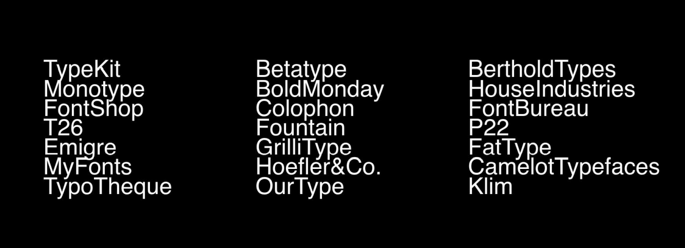
Get your hands dirty and start trying out diff. fonts
Step 5 - Curate
Now here we finally make the stylescapes (finally) :
Start assembling/shortlisting images and stuff you’ve collected with intention.
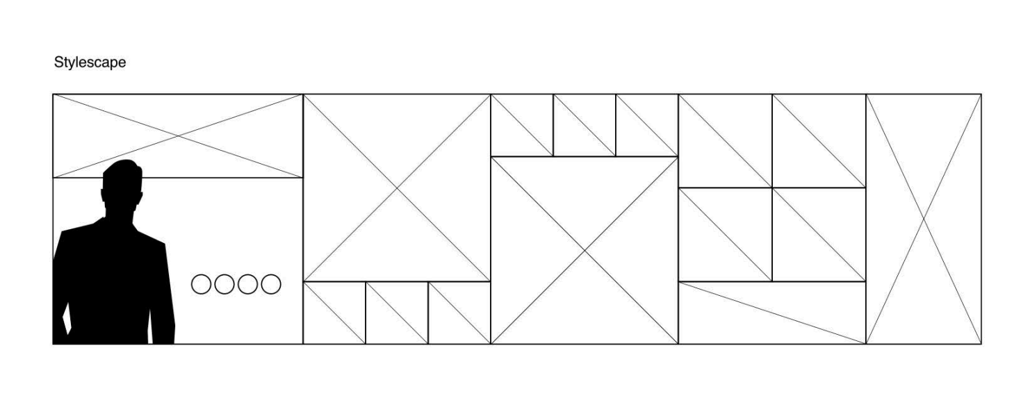
Here’s what the general template of a stylescape looks like:
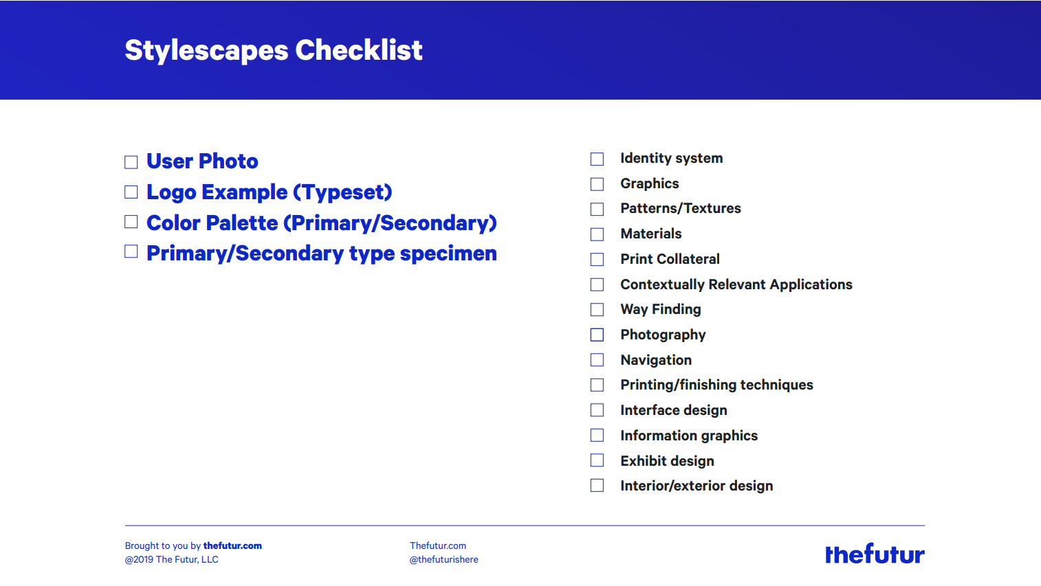
Here’s a checklist of things to include from the course worksheet:
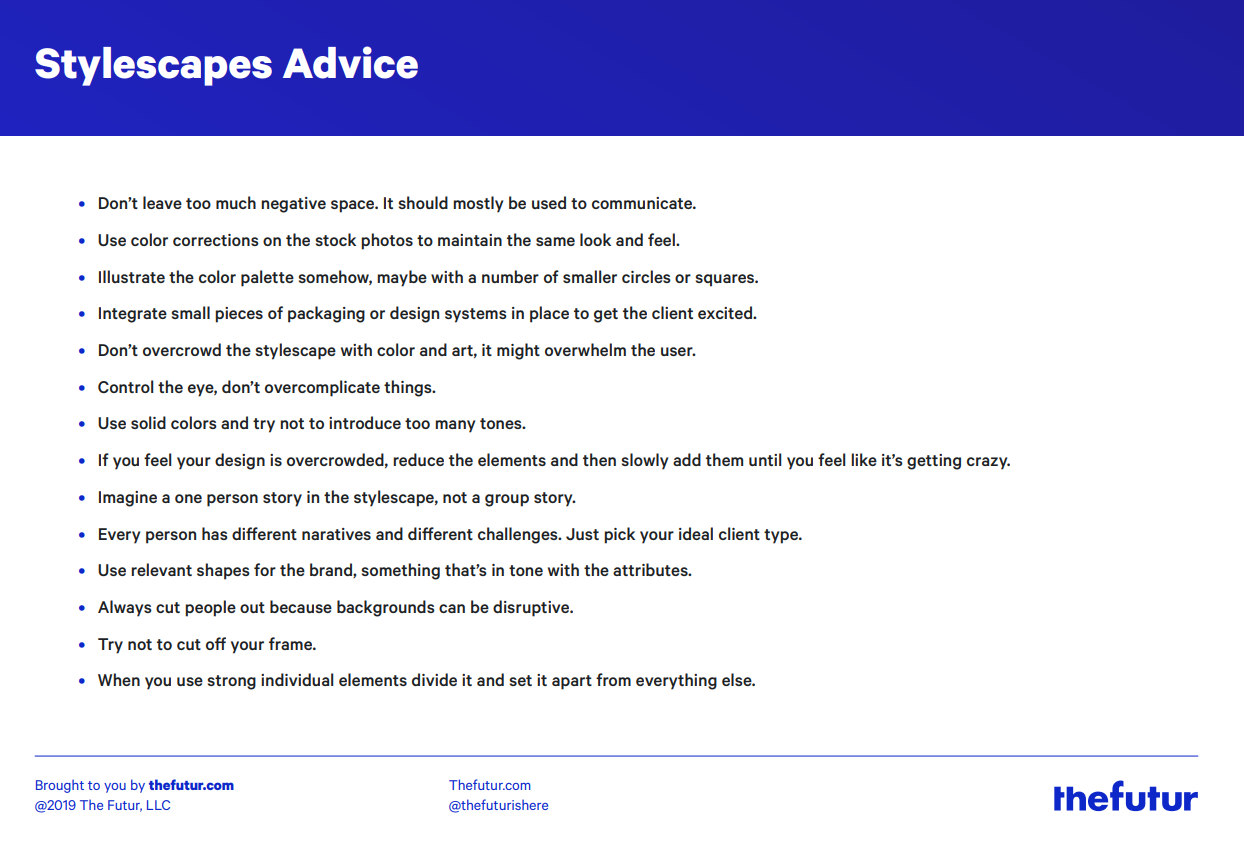
Here’s some ctrl c + ctrl + v advise:
Step 6 - Gather Feedback
- Adopt a helpful/optimistic tone, and have a lovely smile while presenting (even though you’re exhausted and don’t see the point of living by now)
- Have an “anything can change attitude”
- Tell’em its all low commitment right now, so they feel they feel comfortable enough to say it looks SHIT!!
- Gather feedback
- Determine the direction together.


My notes
You’d be surprised to learn how often I practise what I preach. There are times when I just completely skip em’ and jump straight to designing the actual stuff, although I mostly do it when a) I’m working alone and am the only one who’s on “the design team” or b) I feel confident enough with the idea in my mind and I know the client will like it or c) They’re paying me good money and I’m not working on multiple projects at the time, so I can afford to jump straight to the next phase
How many? Three is a good number. Maybe one a bit mild, one a bit medium and one a bit spicy. But there are a LOT of times when I just present one and everybody likes it, so I don’t have to go through the trouble of designing all three of them.
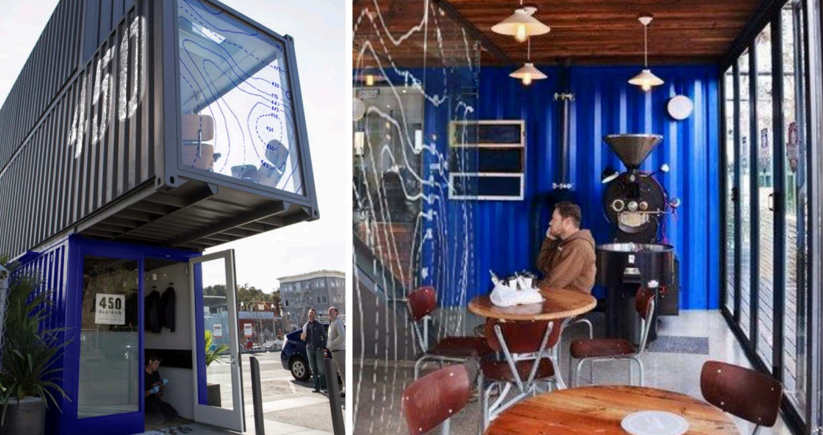
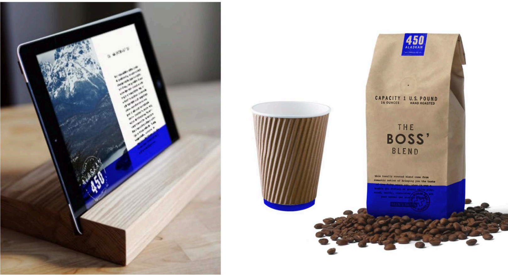
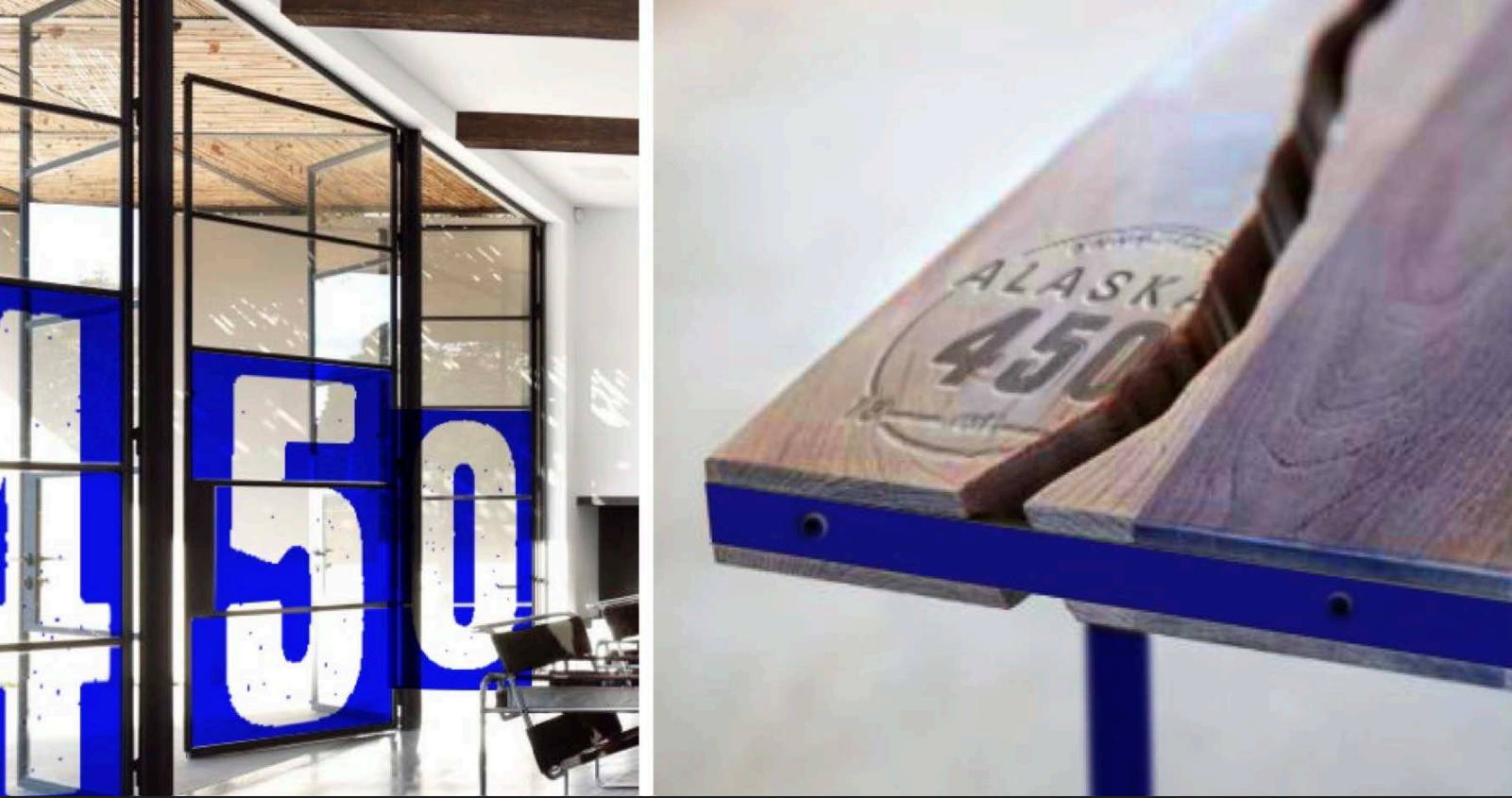
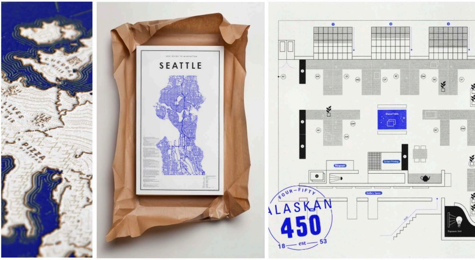
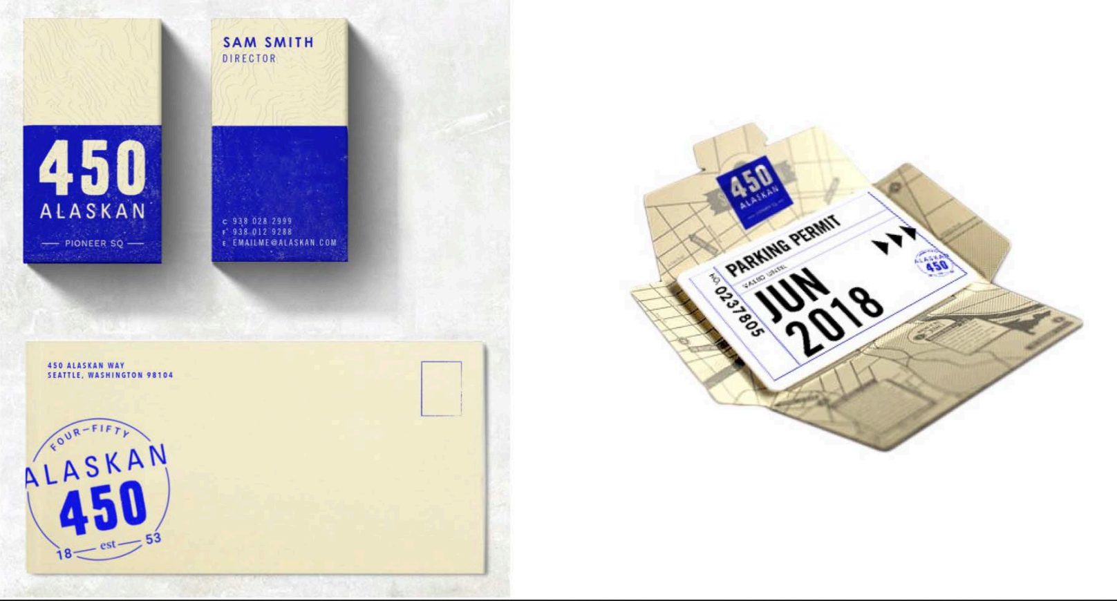
Here are a few examples (not mine):


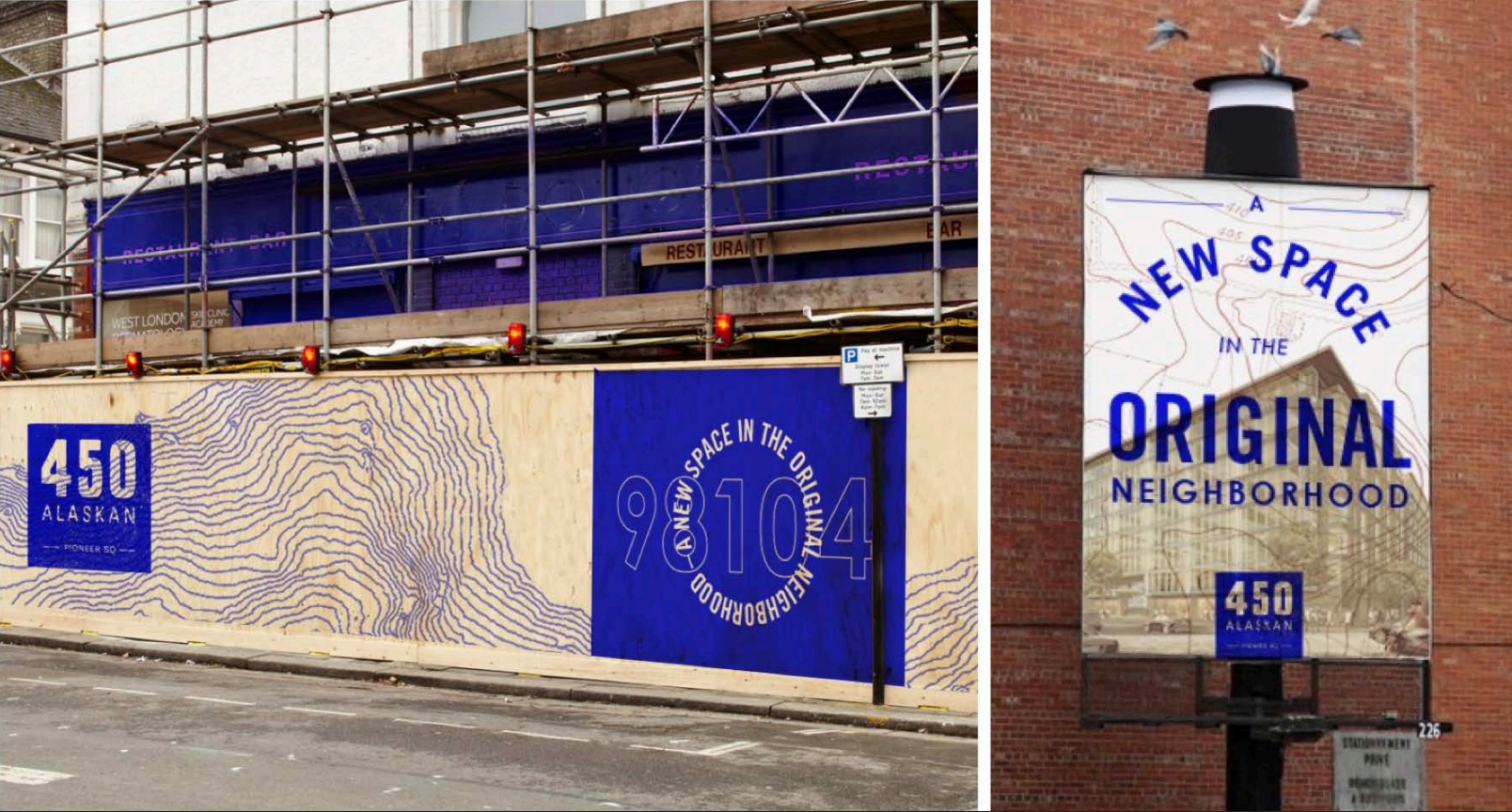
And once in a while maybe you get a bonus from the client to design EVERYTHING:
Inspired? Now you go get some bois.